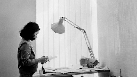
Within the design world, the upper echelons of the discipline are overcrowded with men, and design history is most commonly told from the point of view of male practitioners. The reasons for this are many, and perhaps entrenched sexism is the most obvious one. But it’s simply not feasible to exclude women from this club.
Muriel Cooper would be on my list of first-class 20th century graphic designers. So too would Jacqueline Casey, and I’d also include the Japanese-American designer Tomoko Miho. She is a graphic designer, with a body of thoughtful work, who can compete with any of the heavy hitters who populate the design canon.
Her inclusion in this elite group rests on her ability to combine European modernist principles with a Japanese mastery of spatial planes. Her posters, catalogs, logos, and architectural signage all function perfectly as items of graphic communication, but they also have a seemingly effortless grace, as if she has designed them in the only way possible.
Miho achieves this by balancing all her elements—text, image, background, foreground and materials—to give the viewer a sense of harmonious equilibrium, but at the same time she also manages to deliver the intended message with the utmost clarity. It’s amongst the most difficult things to achieve in two-dimensional design.
Her careful handling of form and spatial relationships can be seen in her logo for Omniplan. Designed in 1967 for a firm of Texas architects, it appears to offer three dimensions, when in fact it is entirely flat. Every time I see it, it appears either convex or concave. And when it is made into a three-dimensional object—a paperweight or a sculpture—she invites the viewer to multiple viewpoints.
Her work never shouts. The eminent Chicago graphic designer John Massey describes her as a “master of the dramatic understatement.” But this body of quiet and understated work, and her quiet and understated persona, have meant that she has been largely overlooked when the greats of the 20th century are assessed. She was awarded an AIGA Medal in 1993, and yet she remains, as design writer Veronique Vienne puts it, “the design world’s best-kept secret.”
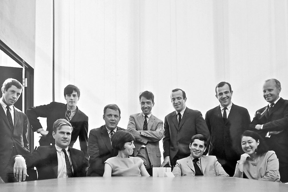
Perhaps her difficult upbringing as a Japanese-American in the aftermath of Pearl Harbor played a part in her lack of ostentation. She was born Tomoko Kawakami, in 1931, in Los Angeles. Her parents were florists, and along with many other Japanese-Americans, the family was sent to an internment camp.
In later life she rarely mentioned her incarceration, yet she is on record as saying that it was an experience that “forced many Japanese-Americans to seek new horizons.” And that’s exactly what she did. She studied industrial design at the Art Center College of Design in Pasadena, California, where she met her husband James Miho.
After graduation, they travelled to Europe where the modernist art and design they encountered had a seismic effect on both of them. As Tomoko told one interviewer, the experience “opened my eyes to design work that was both freer and more structured than we’d learned at Art Center.”
On her return to the USA, she met the graphic designer George Tscherny who sent her to see Irving Harper, Creative Director at the George Nelson office. He hired her on the spot. “It was probably the best place I could have worked at that stage in my career,” she noted. Her arrival was also to mark the beginning of her long association with Herman Miller.
In her view, the Nelson office “was the best design firm in the 1960s, and it was an office with multi-disciplined designers. George Nelson himself was a great influence at that time, an architect, industrial designer and also a great writer about design. He wrote about a new idea for storage systems in his book Tomorrow’s House and the Herman Miller furniture company became interested and made him the company’s director of design.”
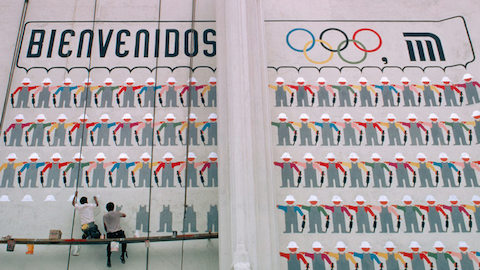
One of her coworkers at this time was the graphic designer Lance Wyman. He was to find lasting fame as the lead designer for the 1968 Mexico City Olympics. Back then, he was a young man learning his trade: “I was very fond of Tomoko,” he told me. “She was obsessed with detail and accuracy. I used to enjoy hiding little mistakes in the work to see if she’d spot them. She always did.”
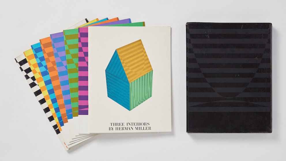
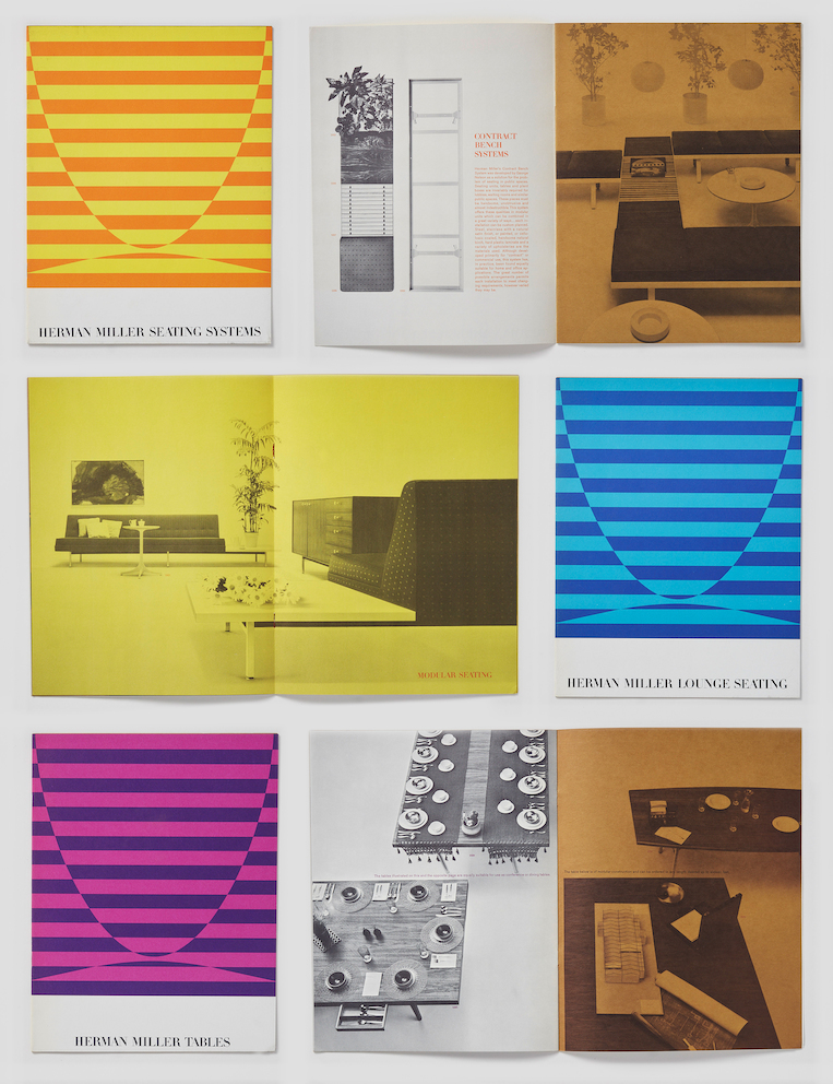
Wyman reserves special praise for her work on the Herman Miller catalogs. “I think Tomoko and George Nelson played a huge part in defining the way furniture catalogs look and function. Clarity and precision were the keys. They also used top photographers such as Lester Bookbinder. You can see their influence to this day.”
It’s hard to find a present-day furniture catalog that doesn’t owe something to Miho and Nelson. They combined matter-of-fact clarity—essential when making an informed decision to purchase—with an emphasis on the sculptural qualities (items are silhouetted against white backgrounds, or stacked in graphic assemblages) that make the purchasing decision emotional as well as pragmatic.
After he returned from Mexico in the early 1970s, Wyman worked with Tomoko Miho on a variety of projects, most notably the signage system for New York’s Pennsylvania Station. Wyman’s robust and explicit graphic approach meshed with Tomoko’s more restrained modernist minimalism, to create a highly functional but aesthetically refined result.
Tomoko worked at the Nelson office for four years, eventually becoming head of the graphic design department. But when her husband was hired by a Chicago advertising agency, she found herself in the Windy City, and it was there that she met John Massey, who at that time was director of advertising design and public relations for Container Corporation of America (CCA).
Via email, I asked Massey to share his memories of Tomoko: “I met her through her husband Jimmy Miho. Jimmy was Senior Art Director at N.W. Ayer, Container Corporation of America’s advertising agency. He and I worked together for many years on various CCA programs and when the Mihos moved to Chicago I asked Tomoko if she would like to join the team at the Center for Advanced Research in Design (CARD), a subsidiary of CCA, which I founded. She accepted and became a major contributor to the broad range of design programs we created for organizations throughout the country.”
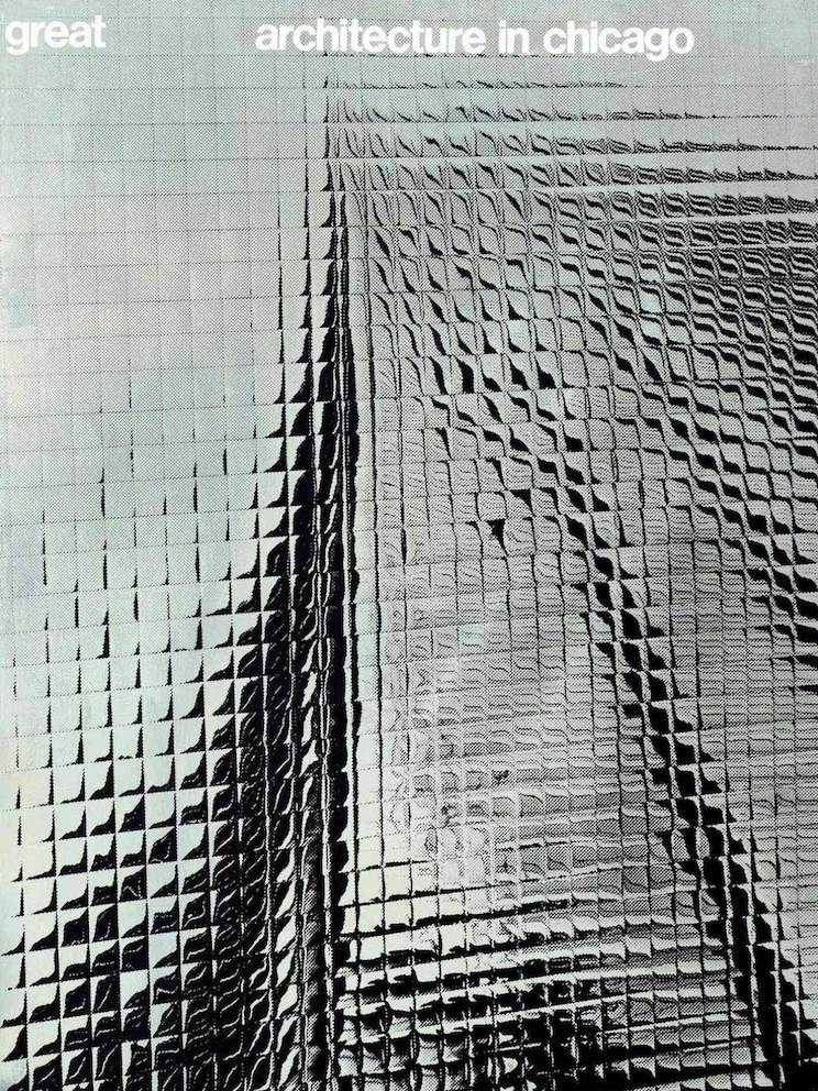
At CARD, Tomoko continued to work for Herman Miller, most notably on a layered poster for the Ethospace office system. Her deft use of translucent paper stocks evoked the system’s function to “open up space” for the office worker. She also produced her most celebrated work, the Chicago Architecture poster: “It was part of a program initiated by CARD with support from the City and the then mayor, Richard J. Daley,” recalls Massey. “Tomoko produced a beautiful poster expressing the spirit of Chicago architecture.”
The poster—which is now in the permanent collection at MOMA—shows Tomoko Miho at her most eloquent. She uses silver-coated paper to capture the reflective nature of Chicago’s famous architecture. A lesser talent would have used an image, or images, of the buildings themselves. But Tomoko captures a poetic truth about Chicago’s modernist structures: they are as much about light and reflection as they are about glass and steel.
As John Massey points out, “the Chicago poster was, and is, extraordinary and classic. It was Tomoko Miho. I have always expressed to those with whom I worked, ‘Create something either extraordinary or classic.’ Tomoko, by her very nature, was both extraordinary and classic, in her self as well as her work. As a result, she was an inspiring person with whom to work and be associated with. She had a subtle sense of humor which added fun and pleasure to her work and provided a certain sense of joy to those around her and those who experienced her work.”
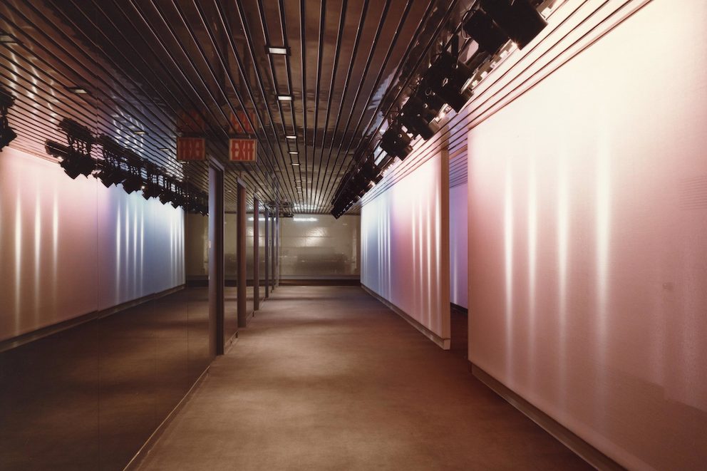
After CARD, Tomoko worked in partnership with her husband under the name Miho Associates. And later, in 1982, she set up Tomoko Miho Design in New York, where she continued to produce her deceptively simple work. Amongst many projects undertaken were lighting installations for Herman Miller showrooms.
As digital technology continues to colonize contemporary graphic design, a new young audience is discovering the pre-digital work of the 20th century graphic masters, amongst them, Tomoko Miho. The recent book Hall of Femmes: Tomoko Miho by two young Swedish designers presents her work to a new generation. It includes a characteristically modest interview conducted shortly before her death in 2012, and it seems likely that with the widespread availability of her work online, and the publication of this short monograph, that Tomoko Miho’s posthumous reputation will grow.
Her work exudes the calm authority of a designer in control of the aesthetic, technical, and semiotic details of graphic communication. Whether designing a business card, an urban signage system, or one of Herman Miller’s famous catalogs, she “carefully gardens every inch of graphic space,” to borrow Veronique Vienne’s resonant phrase.
It’s a body of graphic horticulture that gives her a free pass into the graphic design hall of fame. And yet, with her innate modesty, it’s doubtful that she’d feel the need to take up her place. She’d be much more likely to be getting on with the next job, leaving the preening and medal-waving to the men.
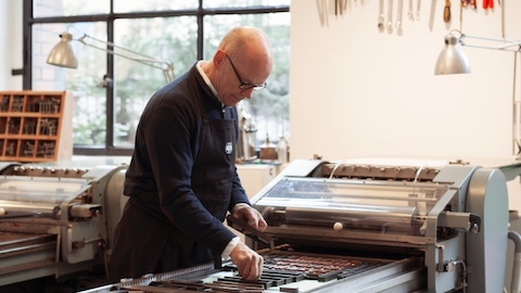
Work of art
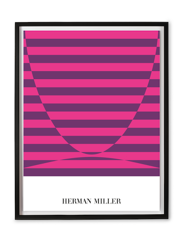
Available to purchase for the first time: the Herman Miller Brochure Cover Poster designed by Tomoko Miho, faithfully recreated from the archives.
