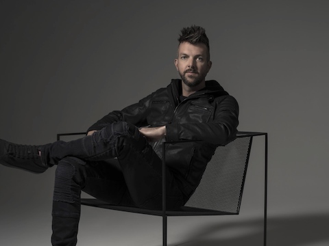
Designer Joey Ruiter’s studio is a tall pole barn painted black, nestled among trees in West Michigan. Sketches of designs ranging from half-baked to fully realized clutter the walls, and to some, the random materials strewn about could seem chaotic. But to Ruiter, they sit at the heart of how he works best—a little chaos, followed by a lot of refinement.
You’ll find designs like Ruiter’s all-black, slim-cut snowmobile moped that just arrived back home after a jaunt at New York Fashion Week as well as a wall of bulky tires and an all-black deer trophy. His ability to stitch together unexpected elements to create highly functional designs might seem like a bit like mad science. But this curious, spontaneous approach has led him to reimagine conventional office furniture designs, resulting in products like Canvas Office Landscape.
“It’s like an approach of a mad scientist—I can handle a lot of conflicting issues at once and make sense of it by stripping it down and getting to the core of it.”
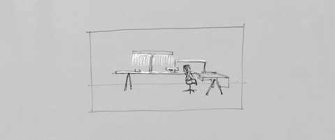
Herman Miller approached Ruiter about a new addition to Canvas to get a different perspective. The request? A workstation that fit within a compressed footprint, all without compromising people’s experiences or reverting to a benching application. He sketched out a few ideas right away that would become a very close match to what Canvas Vista looks like today.
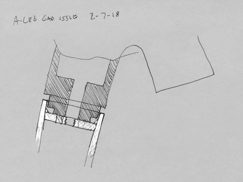
For the next year, Ruiter tweaked and tuned his design, trying to strip the desking system down to the essentials. To him, the best designs seem effortless, where you don’t see the complex engineering that brings them to life. They should look simple, too. Ruiter didn’t want Vista to have anything that felt like filler—add-ons without purpose.
One of Ruiter’s “aha” moments came from considering the view from the workstation—hence the name Vista. Some of his first iterations had arches and doorways to help frame the view of a person sitting at the desk. But Ruiter quickly realized that those were unnecessary. He could specifically imply space and give people privacy, intimacy, and real boundaries—and a sense of ownership for their personal workspaces—without a literal opening.
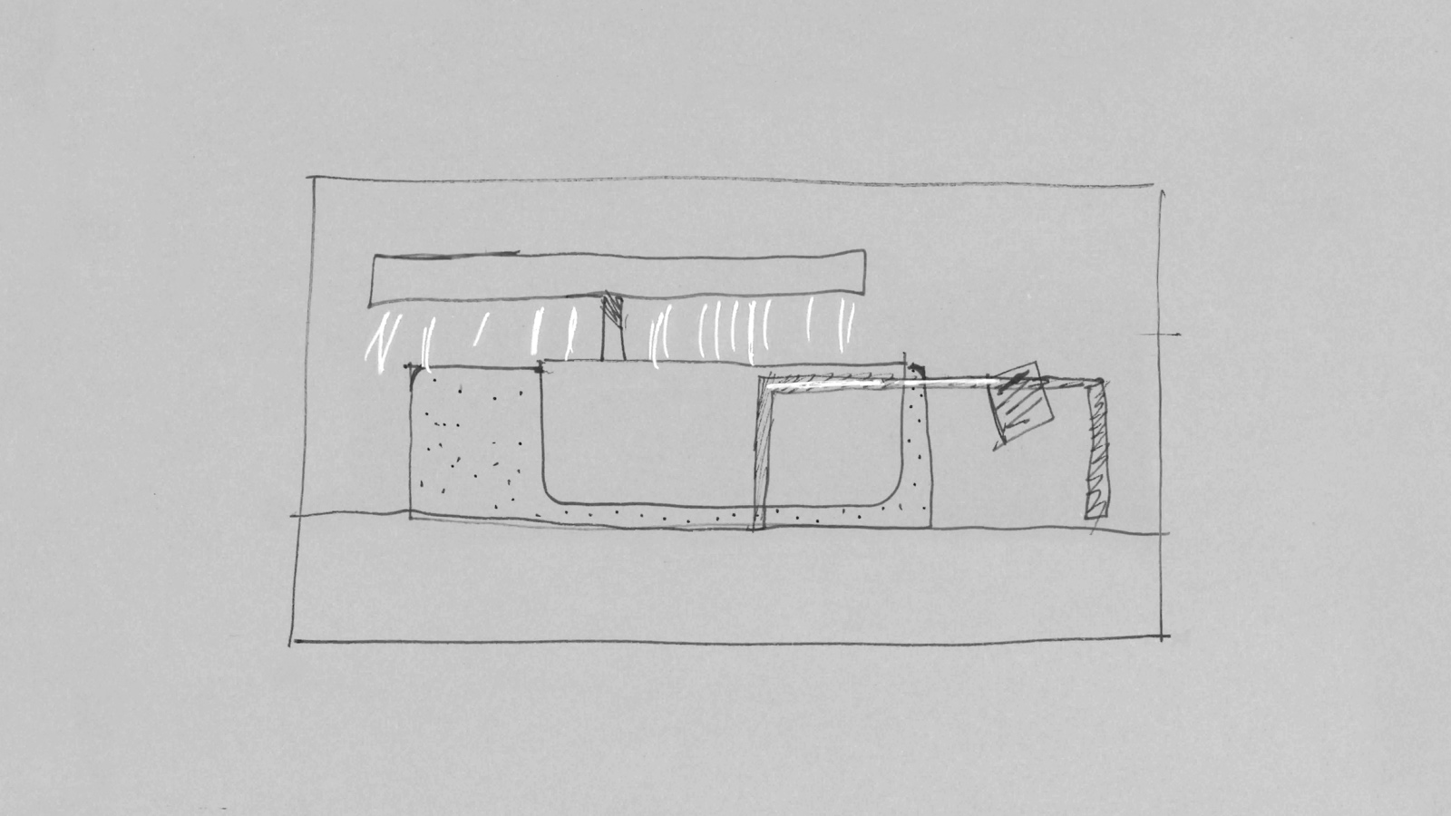
So Ruiter created implied planes and boundaries throughout the workstation, like the open-frame screens and the T-shaped light. These open frames sit atop the power chase, which has screens that can be closed for privacy or opened for conversation. The multi-functional T-Light provides light and gives a visual cue for boundary. With parts that have more than one purpose, freed-up space can be better used.
The result is a cleverly efficient design that has everything it needs and nothing that it doesn’t. How do you do more for people with less space? Canvas Vista provides the right kind of space for people while giving organizations a lot more to work with.


