Never too much: A conversation with illustrator Olimpia Zagnoli
The Milan-based creator of the official 2026 Winter Olympics poster once worried her saturated colors and frame-crowding figures might be “too much.” Instead, they became her superpower.
Written by: Christine MacLean
Photography by: Laure Joliet
Published: February 6, 2026
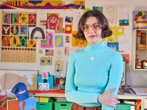
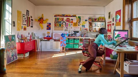
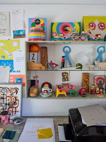
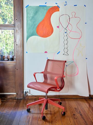
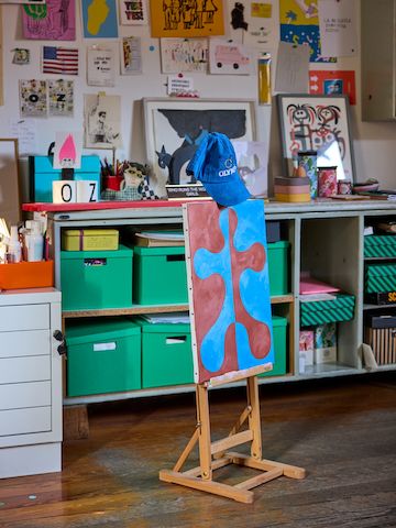
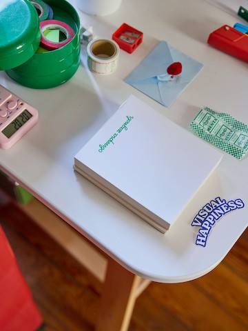
In Milan, Olimpia Zagnoli works in a courtyard studio filled with objects that are colorful, witty, and unmistakably her. The distinctive work she’s created for The New Yorker and The New York Times, alongside illustrations for Dior and Prada, has established her as one of today’s most recognizable illustrators. We visited her home and studio to talk about her creative process, the shock she felt when she saw Alexander Girard’s work for the first time, and what she hopes to explore next.
Did you always imagine you’d express yourself through art, or was that something you discovered over time?
I come from a family of artists. My dad is a photographer. My mom is a painter. I wasn't really attracted to those things. But one thing that I always did was drawing. It was always a sort of a planet where I could go and be with my thoughts and concentrate on my stories and characters alone in my room, lying on the floor. There was always an element of calmness and privacy because that was my bubble.
How did your relationship with color begin, and how has it changed as you’ve grown into your work?
My life before moving from Reggio Emilia, a city in the north, to Milan [at six] was very colorful. Milan was like the business city, the gray city. I looked around and all the kids were like mini businesspeople with very elegant clothes and perfect hair. And I was like short hair, very colorful dressing. My relationship to color changed completely because I felt like I was the strange one. But at the same time, I wasn't judging the background I was coming from, nor did I want to change drastically.
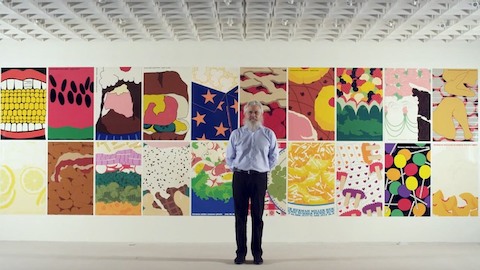
I've always felt like my relationship to color was essential to express myself and also be accepted for what I was. But when I started drawing as a living, I felt this embarrassment to use too many colors. I felt like I didn't have a voice bold enough to go really crazy. So I started in a very soft way. Only by practicing and getting bigger as an artist and as a woman, understanding more what my place in the world was, did I feel more authorized to add more color—making combinations that for me were extreme. Little by little, I developed a dialogue with these colors.
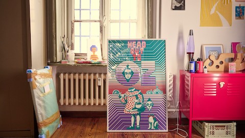
Your poster for the Milano Cortina 2026 Olympics is already becoming iconic. What inspired the way you approached it?
The idea behind the poster was to celebrate both athletes attending the Olympics, as well as all the participants going to see the competition or the ones watching from home. Everyone brings a piece of their personality to the event and that’s what I wanted to highlight. Both the framing of the poster and the use of glasses are elements I use in my visual vocabulary. The colors of the poster are inspired by the Olympic rings, which dictate the palette of the piece.
When I began [my career], a lot of my characters were small in a corner of an illustration. Slowly but surely, they got bigger, meaning physically but also demanding more space. I was able to let my characters, especially women, take more space in the grid, pushing the boundaries to the point where the character almost breaks it. Having people in the foreground comes very natural now.
Your home and studio feel deeply personal. What influences how you shape them?
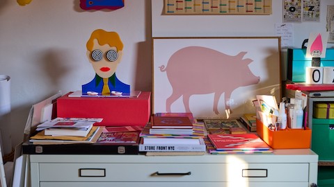
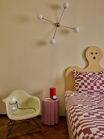
My mom has a passion for design. She was the one that first introduced me to the Eameses. Her taste is in everything around me, even if it doesn’t take the same shape as at her house. She has a more typically mid-century taste. I have drawn from those references but also added my own personal inspiration, filtered through the advertising, packaging design, candy, and plastic objects of the ’80s. [That led to] traits that have now become distinctive of my visual language.
What part of your studio feels like its true center?
I’m very lucky because my studio has a big wooden window that overlooks the courtyard and there are two giant magnolia trees. It’s what I see when I work. There’s a connection with the outside world. When you’re an illustrator, you often work on your own. It’s nice to have a window that reminds you there’s a world out there and this relationship with a little bit of nature brings you back to what’s important.
What is your creative process?
The process is messy in the sense that I do a little sketch in the corner of my agenda and then I go to the cafe and I draw something on a sugar package, you know. So everything is messy in collecting all this inspiration, thoughts and stuff. But then it comes out in a way that feels controlled, like polished. I'm spending so much time thinking that when it's time to actually touch the material or finish an illustration, I can do it in maybe a couple hours because everything has been done before that, like the thinking.
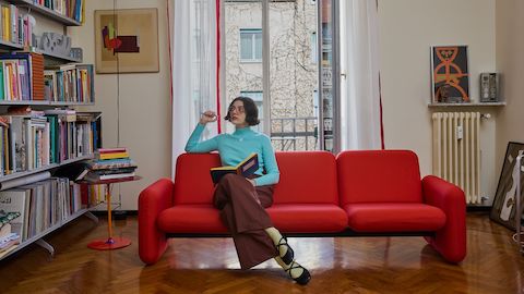
When Herman Miller reissued the “chiclet” sofa, Zagnoli, a longtime admirer, took it as a sign she should buy one for her home. She has three other red sofas, as well. When it’s time to buy a sofa, “I’m always like ‘Okay, this time it’s not going to be red,’ and then I end up picking the red one,” she says.
Tell me the story behind your red “chiclet” sofa.
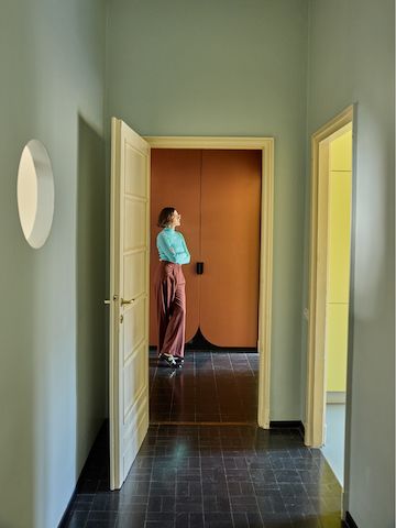
During Covid, I found this apartment in a Gio Ponti building. I was attracted to a clean aesthetic like Bauhaus and I knew I wanted to break that rigidity. I looked up hundreds of couches and the chiclet was one of my favorites, but it was impossible to find a vintage one. Then finally there was a reissue and I was like, “that’s a sign.”
Also, I am obsessed with candy to the point where I wrote a book about it. Chiclet is how chewing gum is called in some regions in Italy, so I find another connection aside from the softness and round shapes and the color. I feel like it really resembles my aesthetic.
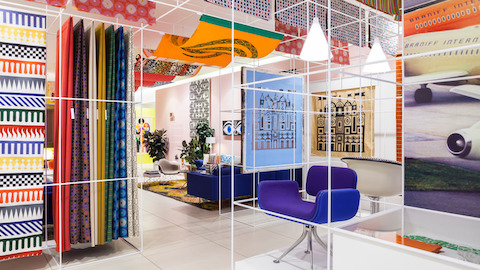
You encountered Alexander Girard’s work after you’d already developed your own visual language. What was that moment like?
I was almost breathless because, aside from the embarrassment of “Oh my God, somebody did it before me and now it looks like I copied them,” which I think is quite common among artists, there’s also a part of me that's shocked that somebody else can have the same connection with how you use lines and colors and choosing how to synthesize something that comes from nature, from real life, into a shape.
Are there other Herman Miller designers you feel particularly connected to?
The Eameses, for sure. I wept when I was in front of [the Eames House in Pacific Palisades, California] because there’s a deep connection in terms of the care for the details, for the colors, for the materials, for that kind of living space that allows you to be creative and free. And George Nelson. There’s a certain fun in the way he uses shapes that I always find exciting.
I see you also have a limited-edition Steinberg Eames chair!
Steinberg is the illustrator—like a pop star to me. I’ve always been a curious observer of his work and practice. When the Steinberg edition came out, I talked to a friend and said, “Are we getting it?” She said yes, and it was a decision made at midnight with a sense of craziness, like “OK, let’s do it!”
Italy has an expansive design history, from Mussolini’s propaganda posters to Munari’s radical simplicity. Where do you put yourself within that lineage?
Definitely as far as possible from Mussolini. Hopefully very close to Bruno Munari. I started with Munari’s children’s books and the more I grew up, the more I was in contact with new parts of his work. His sensitivity toward observing is very Italian because it feels like the product of sitting at a cafe and looking around the world and questioning. I still feel like it's the most important thing to do in life—to understand other people, cities, design, by observing and understanding what people want and need and why.
What has been the project that has been most meaningful to you?
I really liked working with the MTA [Metropolitan Transportation Authority] in New York. I made a poster called “New York View” in 2014. It was in every subway station, and I started getting so many messages and photos from normal people like just commuting every day. And it made me so emotional because there’s a very solitary dimension to my work. It was so powerful because images are so powerful. They don't need translation. People just react to them. To be like a channeler for this power is a great privilege.
And if you couldn’t be a designer at all, what would you choose instead?
I would like to have a gelato place with very creative gelato flavors. It would be color-based. So you can have a blue and a red or a yellow and purple. It doesn’t sound healthy, but I would use very good coloring.
What kinds of projects do you dream about taking on next?
It changes every day, but I would like to work with a production designer on a movie—to work on the interiors and visual aspects. I’d also like to make a documentary about people who suck their thumbs and I’d like to make more public art, like a fountain.
