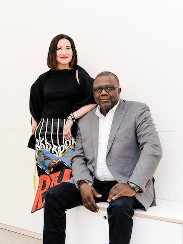
They also found inspiration in the reconciliation of dichotomies. Their design research showed that people do their best work in environments that offer both “social buzz” and a sense of boundary, like trains, planes, and cafes. They realized that people want to see and be seen as part of a community, even if they’re working alone. They also knew that people are most productive with the ambiance of background sound but not when they can hear the specifics of a conversation.
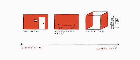
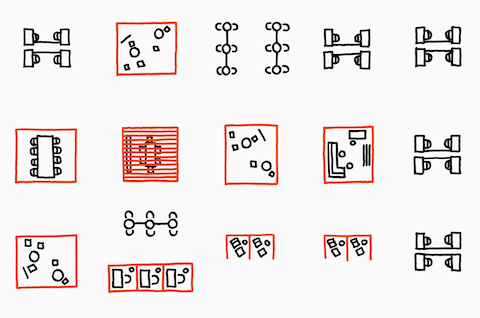
Overlay is designed to create long-term value for organizations by making seemingly opposite needs and wants—open yet closed; alone yet together; clean yet messy—co-exist. As Birsel says, “if you can make any two opposites co-exist, you can have your cake and eat it, too.” When it comes to the office, Overlay makes the unthinkable, possible.

