Companies use typefaces to embody their personalities—or as marketing departments are wont to say, their “brand values.” It is often noted that pet owners come to resemble their pets, but can it ever be claimed that a typeface resembles an organisation? Surely it’s asking too much of 26 letterforms and a few punctuation marks to embody a corporate entity?
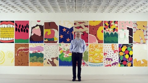
Take the font FF Meta. Does it exhibit the Herman Miller persona? The company has used the typeface as its corporate font since the late 1990s. You’re reading it right now, come to think of it. It was designed in the previous decade by Erik Spiekermann, and introduced by Herman Miller’s then-Vice President of Creative Design, Steve Frykholm. Prior to FF Meta’s adoption, Helvetica had been the firm’s principal font, but after three decades of the Swiss typeface, Frykholm proposed a change: “We explored serif, sans serif, and script fonts,” he says, “but in the end we settled on Erik’s Meta. It was computer-friendly, and I also liked Erik. I’ll admit it was a rather subjective choice.”
There’s an irony here: Frykholm dumped Helvetica for a typeface that came to be known in typographic circles—thanks to its intense popularity at the beginning of the digital era—as the “Helvetica of the 90s.” Now, FF Meta looks nothing like Helvetica. In fact, Spiekermann is on record as describing it as the "complete antithesis of Helvetica." Yet just as Helvetica defined its era (roughly speaking, the late 1950s to mid-60s), FF Meta also defined its own. In the 1990s, electronic communication fast became as important as printed communications, and a new typographic syntax that worked on screens as well as the printed page was required. The open apertures of FF Meta’s letterforms, one of the font’s defining qualities, makes it suitable for both print and electronic applications.
But can we discern something about Herman Miller’s molecular structure in FF Meta? Who better to ask than Spiekermann himself?
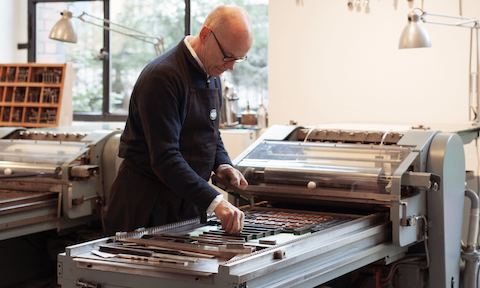
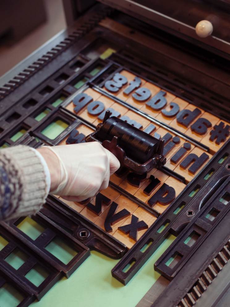
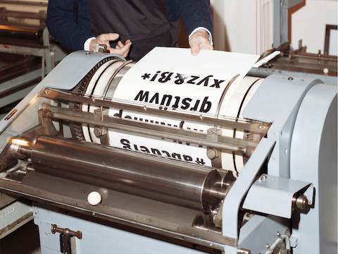
A luminous presence in the world of graphic design and typography, Spiekermann combines a love for traditional printing techniques (he runs a hand press in Berlin), with a deep understanding of digital design technology (until recently he was chairman of digital agency EdenSpiekermann). He is one of a handful of designers widely known to both the design and business communities, and his impressive list of clients includes Berlin Transit, Düsseldorf Airport, Bosch, Volkswagen, The Economist, and Nokia. His writings (and tweets) on design and typography and his numerous show-stopping design conference appearances have made him known to nearly everyone working in design. A big chunky book on Spiekermann’s life and work, Hello, I am Erik, was published in 2014. Now in his seventies, he exudes the physical energy and intellectual vim of someone half his age. He is witty, argumentative, and bursting with opinions on most subjects.
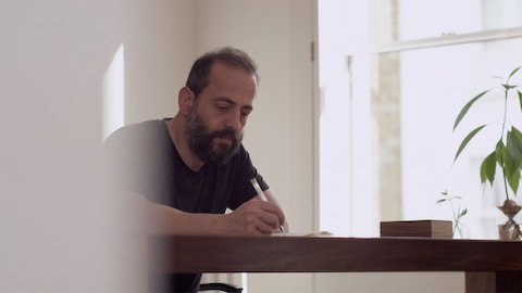
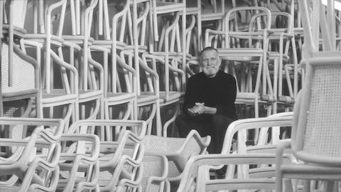
I caught up with him on one of his visits to London—you can add “peripatetic” to the many adjectives that apply to him; he flits between homes in Berlin, San Francisco, and London. We met at the newly opened Design Museum, where I asked him if he considered the marriage between FF Meta and Herman Miller to be a successful union: “I think it’s very appropriate,” he said. “Meta was made by hand and has that human touch. And I’ve always liked Herman Miller furniture. It doesn’t look like it comes from a factory. The stuff always had a more humane quality than a lot of other furniture—especially German-engineered furniture. Herman Miller furniture always impressed me as being approachable, and I think Meta is very approachable.”
It’s a view shared by Frykholm: “I find Meta and all its variations very easy to work with. It’s like a friend or a good collaborator.”
FF Meta was not designed with Herman Miller in mind, however. It was designed for the German Post Office (Deutsche Bundespost), which hired Spiekermann to rethink the entire graphic design system for the organisation—everything from order forms to the once ubiquitous telephone directories. Deutsche Bundespost’s previous font? Like Herman Miller, it was Helvetica. With typical forthrightness, the then 38-year-old Spiekermann urged them to drop it, announcing that it was “unfit for purpose” and “overused.”
Herman Miller dumped Helvetica for FF Meta, a typeface that came to be known in typographic circles—thanks to its intense popularity at the beginning of the digital era—as the “Helvetica of the 90s.”
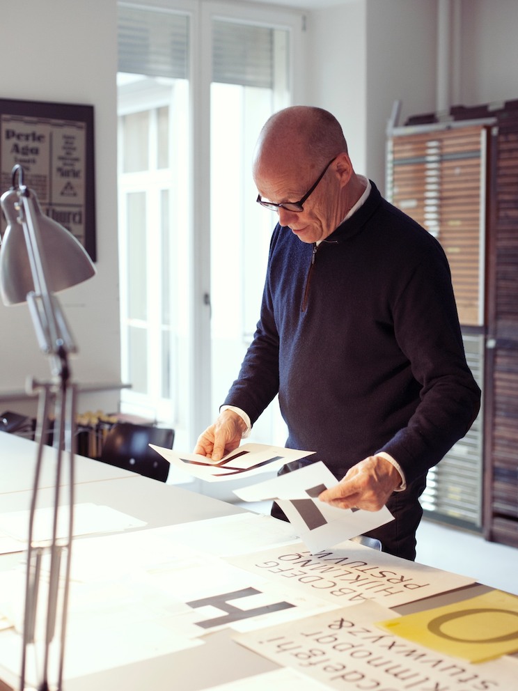
Spiekermann recognised that it was the Bundespost’s phone books that offered the greatest potential to benefit from a new typeface: “With just a change of typeface you could save a million trees and be a hero,” he recalls. And so he set about designing FF Meta (then called PT55), a process that involved meticulous research into the proportions of classic letterforms and analysis of developments in printing technology. “We have a great German word, ‘Kopfgeburt’—it means something that springs from your brain. The design of Meta wasn’t like that at all. The process was very theoretical. It wasn't emotional. This was because at that time I had no experience and couldn’t rely on talent or practice. Everything had to be deducted.”
So thorough was Spiekermann’s process that he arranged to have his new letterforms tested for legibility by perception scientists at Braunschweig University of Technology. “There was a guy there who looked at it, and in his view, there was a little too much ‘noise,’ which you can see in my early drawings. So, I toned down the contrast. There were a couple of numerals that he said were a little too in love with themselves—mannered, in other words.”
For the presentation of his new typeface to Deutsche Bundespost, Spiekermann borrowed an early Macintosh computer (it was 1985, the year after the Mac was launched): “I put the computer on a desk in front of them and took a diskette out of my shirt pocket. The typeface is on this, I said. They looked at me, and then at each other, and thought, he’s stark raving mad. As far as they knew, type was heavy and came in drawers. It smelled and it was dirty. They thought I’d gone bonkers.”
So too did the “artistic council” who advised Deutsche Bundespost on aesthetic matters: “They were artists. They carried rolls of canvas under their arms and had baggy corduroy trousers. I probably had scruffy longish hair at the time, and a beard. I looked like a designer to them. And of course they thought I was the devil. I think they felt sorry for me.”
Not sorry enough, however, to accept his typeface: PT55 was rejected leaving Spiekermann free to develop and market it as FF Meta. Once it had been fully digitised and made available for Mac, it became one of the star typefaces of the early digital era. Over time, the FF Meta family has been extended to include additional weights and widths, as well as companion families. Other hands have contributed to its evolution, although Spiekermann’s original vision is still clearly visible in its more recent manifestations. Since its inception as a digital font in 1990, the typeface has been used as a corporate font by institutions and businesses of all kinds: these include Imperial College London, The Weather Channel, the German radio station WDR, and, of course, Herman Miller. It has been deployed in numberless settings ranging from medicine packaging to signage, and in 2011, it was added to the Museum of Modern Art’s permanent collection.
As to FF Meta’s incredible run at Herman Miller, Frykholm takes the long view. “Of course, one day some young designer will have a rationale to change it, but Meta does have longevity. Geez, in a few years we’ll have been using it for 20 years.”

