Most subconscious opinions about a product are formed within the first 90 seconds of seeing it. What’s more, between 62 and 90 percent of those opinions are based on color alone. Laura Guido-Clark, creative director of Materials for Herman Miller, is particularly fond of this statistic, taken from a study conducted by the Institute of Color Research, because not only does it validate her work at Herman Miller, it also reinforces Herman Miller’s overarching opinion that purposeful designs can facilitate productivity and pleasure. As Guido-Clark sees it, “We need to be leaders with color. We cannot underestimate how powerful a communication device it is.”
Many factors go into determining color in a design and what it should communicate. Guido-Clark uses various methods to determine color palettes, one of which is a process she trademarked called “climatology.” Unlike traditional trend forecasting, “climatology” involves taking “temperature readings” of the current emotional, political, social, and economic environments and breaking them down into human values and emotions. Once a collective desire is determined, a palette and materiality is created to evoke that emotion. For the color refresh of Herman Miller’s three most popular solid color lines, Ground Cloth, Resonance, and Crepe—textiles that are available on a number of Seating and Workspace products—the team wanted to create an optimistic palette of colors that felt expansive, celestial, and lighthearted. “People don’t switch on and off as much as we think,” she says, referring to the narrowing divide between work and home life and people’s desire to create spaces that universally reflect their desires. “People want to make a seamless connection.”
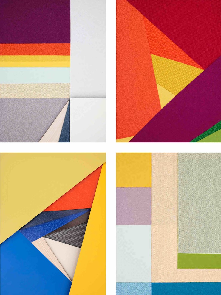
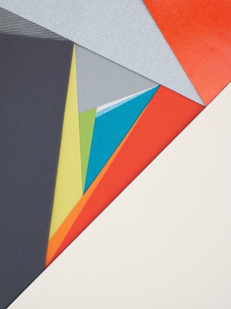
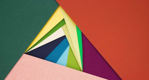
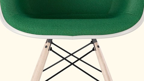
Photographer and stylist Carl Kleiner creates artful compositions with our refreshed materials palette, including our newly reformulated green fiberglass and our Crepe, Resonance, and Groundcloth textiles.
Once an intention is set, the process of coloring product becomes a lot like solving a puzzle. The team takes into account the workhorse neutrals and bestsellers, determines how colors might be affected by matte or gloss finishes, or how well it holds up against various materials such as laminates, plastics, and veneers, and then they systematically begin filling in the holes. Their ultimate goal is creating a palette that appeals to the senses. After all, nearly 85 percent of consumers believe color accounts for more than half of their decision whether or not to purchase a product.
Capturing a sense of play in color is not only essential to appealing to consumers and the contract industry alike, it’s also very much a part of Herman Miller’s DNA, dating back to the work of Alexander Girard, the company’s Textile Director from 1952 to 1973. “Girard made adults feel like a part of them was awakened, the part that they’d been taught to keep down in order to work,” says Guido-Clark. “We are at that same juncture right now where playfulness is valued. What I want to say is: There are no wrong colors.” The goal is to build enough layers into any given set of textile or product offerings so that, if a designer wants to build a palette exclusively in a family of reds, for example, or color-block with hues within the same value, they will have a number of options to choose from. As Guido-Clark sees it, “It is about providing the freedom to explore and play.”
“We need to be leaders with color. We cannot underestimate how powerful a communication device it is.”
- Laura Guido-Clark
