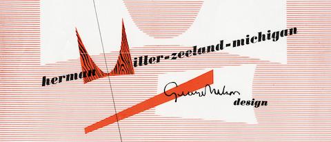
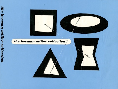
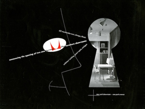
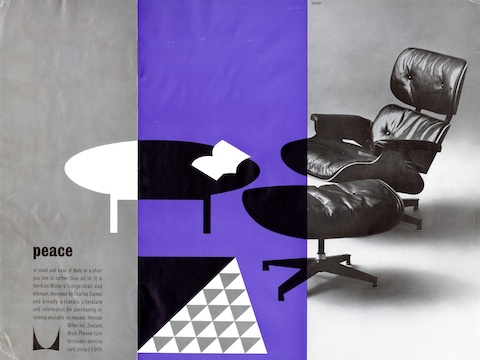
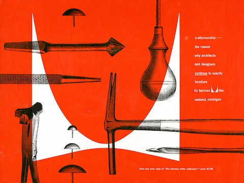
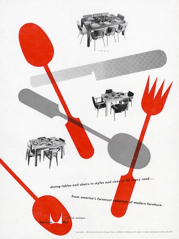
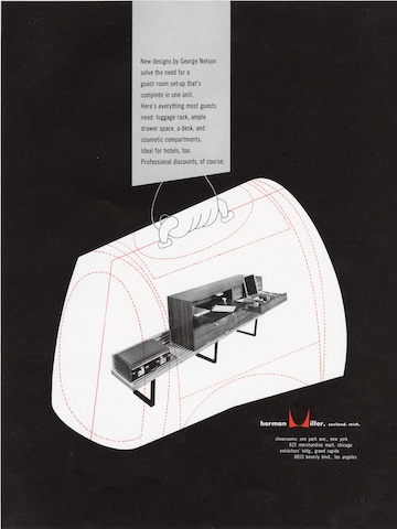
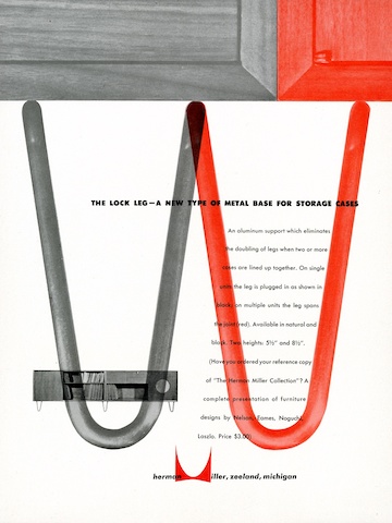
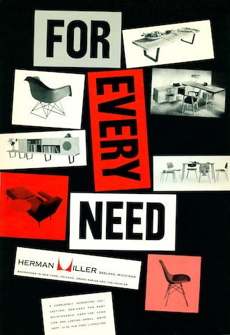
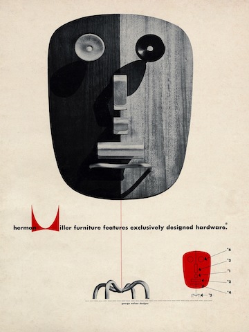
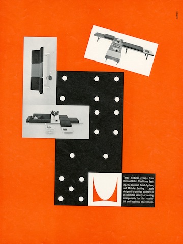
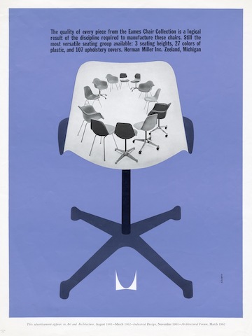
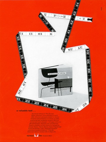
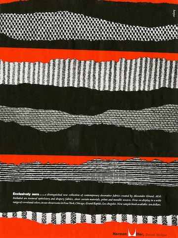
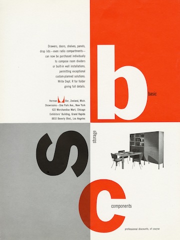
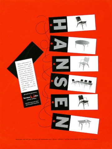
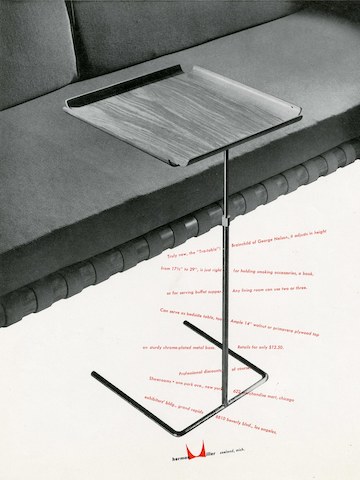
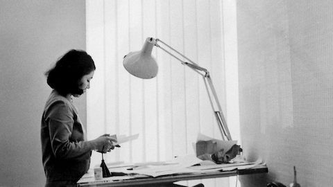
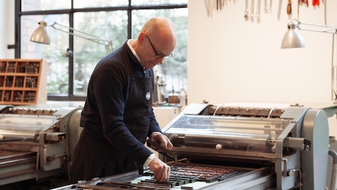
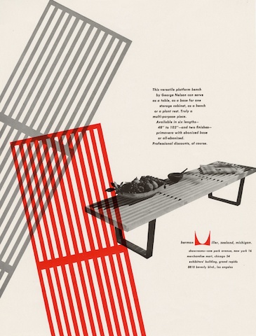
Imagining a sheet of paper as building site will give you a good sense for Irving Harper’s approach to graphic design. As the Swiss magazine Graphis noted in a 1953 survey of his print work for the Nelson Office, it’s an approach not dissimilar to that of an architect. “The page on which to print is regarded as a site on which to build…. Pictorial material, often broken into fragments, is organized by asymmetrical harmonies.”
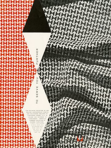
From his start working with designer George Nelson in 1947, through his tenure as design director at the office until 1963, Harper brought a visual coherence and energy to everything he created—from furniture, to ads, to clocks. But it’s in the printed collateral he did that his approach to design as a total experience is most easily understood. Whether evoking three-dimensional spatial gestures in a two-dimensional magazine spread, or turning a functional object like a clock into a graphic abstraction, or giving a simple typographic treatment the textural quality of a swatch of fabric, everything he designed has a deeper sense of dimension.
Formally trained as an architect, Harper studied in his native New York at Brooklyn College and Cooper Union and eventually landed his first architectural job for Morris B. Sanders, who had been invited to design the Arkansas pavilion for the 1939-40 World’s Fair. He put Harper in charge of interiors, inadvertently altering the course of his career. As Harper recalled to Julie Lasky in an interview for her book Irving Harper: Works in Paper, “‘[I] found design much more interesting because it was entrepreneurial.’ In an architecture office, ‘it’s hard to rise to the top.’ And ‘design work is more varied. Everything is a first-time thing. You learn a lot more.’”
Harper’s Path to Herman Miller
Harper’s early foundational work for Sanders and then for Gilbert Rohde, the illustrator-turned-product designer who had a hand in shepherding American furniture design into the 20th century through his work with Herman Miller and Heywood-Wakefield, helped solidify Harper’s position as a designer. It also helped him land the job at the Nelson Office. Ernest Farmer, an old colleague from Rohde’s office, had moved on to work for Nelson, and it was he who convinced Nelson to hire Harper to design graphics for the office. Though Harper worked across furniture and industrial design in the Nelson Office, his advertisements—especially the collateral work for Herman Miller, for whom George Nelson was then design director—were often credited to him by name.
The Herman Miller Logo
When Nelson undertook his debut furniture collection as design director for Herman Miller, he was also tasked with creating the graphics and advertising work to support its sale. This included a new trademark that could be heat-stamped into the wood furniture. Nelson had initially approached Paul Rand, one of the most sought-after graphic designers at the time (and well revered for his identity work, most notably the IBM logo) to create the mark. But when Rand backed out of the project, the job went in-house and ultimately landed in the hands of Harper.
The first ad for the collection was to be printed in 1946, prior to any tangible furniture to photograph or illustrate and was limited to a two-color printing process. But like any good designer or architect might, Harper took note of his limitations, and fashioned a monumental, French-curved M in bold red, set against a black and white wood-grain texture. The Herman Miller logo was born. Harper later called it the century’s least expensive corporate branding, but even despite the mark’s humble beginnings, the bones of that original M (today, minus the wood grain) have endured.
