The year was 1967, and Herman Miller was about to launch a new version of its original workstation product Action Office. It coincided with the Beatles having just released the song “Getting Better” (It’s getting better all the time . . . No I can’t complain), an upbeat lyric which, notes Herman Miller consultant and design guru Ralph Caplan, “seemed to the ‘desperate copywriter,’ a good fit for the new AO, which didn’t look, or claim, to be revolutionary but merely offered a number of improvements in the office environment.”
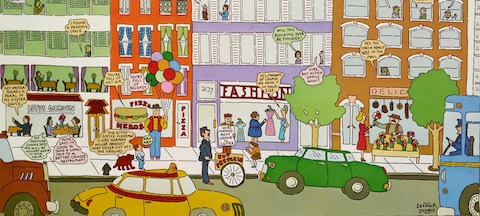
Caplan worked with Herman Miller design director Steve Frykholm on the concept for the ad called “Things Are Getting Better…” and envisioned a group of urban office buildings, with lyrical statements of their betterment floating from the windows. “Steve, whose own posters [which defined Herman Miller’s identity] were already celebrated as corporate graphic pleasures, thought that Herman Miller ought to commission a famous artist to illustrate and sign a poster that would work both as an ad and as a nice gift for special customers. He chose Seymour Chwast, whom I doubt he had ever met. I know I never had, although I knew his name, which I wasn’t sure how to pronounce,” Caplan recalls. Frykholm mocked it up, and they flew to New York to show it to Chwast.
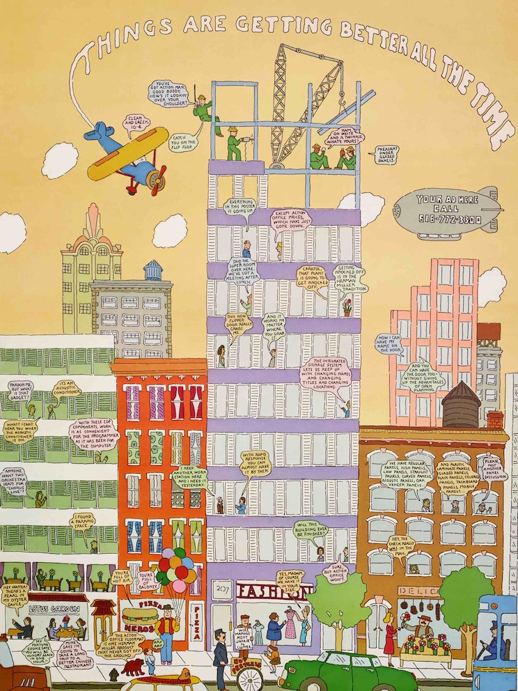
Things Are Getting Better All the Time poster illustrated by Seymour Chwast. Art direction by Steve Frykholm. Text by Ralph Caplan.
At the time, Chwast (pronounced Qwast) and Milton Glaser were the most well-known names in mid-twentieth century graphic design and illustration. As cofounders of Push Pin Studio in the mid-1950s, they invented an original proto-postmodern, neo-retro alternative to International Style Modernism. The Push Pin Style was a shared aesthetic comprised of an eclectic mash-up of once stylish vintage and passé decorative graphics (Art Nouveau and Art Deco) and eccentric type forms. The studio’s collective graphic language dominated book and record publishing, advertising, posters, packaging, and lettering-typography in the United States for two decades, and was honored by awards and exhibitions in North and South America, Europe, and Asia. After their twenty-year partnership ended in 1975, Glaser went his own way to design everything from magazines to supermarkets, and Chwast retained the Push Pin name and style. Both continued to distinguish themselves as talented and influential visual commentators. To this day both of them continue to experiment with form and content.
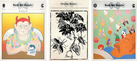
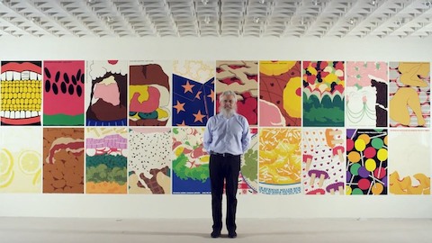
Push Pin Graphic #64 Mothers, 1980; Push Pin Monthly Graphic #1 Devil’s Apple, 1957; Push Pin Graphic #74 Adventures in Sleep, 1978. Push Pin Graphic was a freeform publication sent to clients and friends that ran from 1957 to 1980. With Chwast acting as art director and designer, each issue was based on a different theme and included articles, fiction, and illustrations by the award-winning Push Pin Studios members.
However, they have their differences. It is the prodigious and virtuosic illustrator, author of children and adult books, poster designer, typeface designer, graphic novelist, painter, and sculptor, Chwast, who is arguably the more comedic member of the duo. Which is perhaps another reason that Frykholm and Caplan, also known for their wit and playfulness, felt that Chwast would fit the needs of this advertisement.
Chwast’s response to the commission was businesslike, says Caplan, if a bit laconic: “He didn’t claim to have recognized a great idea (it wasn’t), but acknowledged that this was a straightforward assignment that he was pleased to take on. Seymour’s contribution was excellent but minimal. Frykholm could have done it himself, and in fact had, for what we had brought Seymour left little room for the development we ought to have sought from him.”
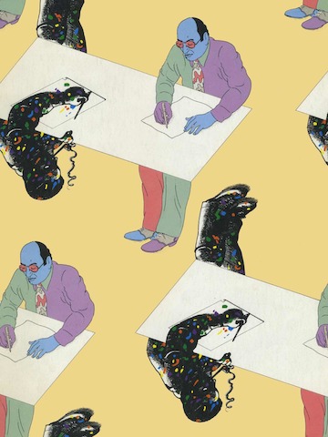
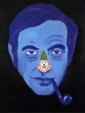
Milton Glaser as illustrated by Seymour Chwast. The duo drew one another for the catalog that accompanied a 1984 exhibition of their work in Japan.
“He didn’t claim to have recognized a great idea (it wasn’t), but acknowledged that this was a straightforward assignment that he was pleased to take on.”
—Ralph Caplan
Chwast believes that the pictures he did for Frykholm “were unique for me.” And for an artist who owns as many personal styles as Chwast has mastered, it is not unusual to try something a little bit different with his assignments. Whatever the distinction was, and he cannot exactly recall, they were done with storybook simplicity, comic book intensity, and coloring book innocence that carries the idea forward.
Like all Chwast’s work, the art for “Things Are Getting Better” holds up today because a good concept alone does not always result in the best work. He deploys a confluence of skills and talents and so intuitively aligns form and content that one does not skew the other. He makes dozens of sketches to achieve the perfect gesture, but his finishes are nonetheless unfinished looking instead, ranging from gnarly to precise, from naive to sophisticated. His work rises above the conformity imposed by trends and the traps that others have fallen into. It is a tribute to his uncompromised instincts that he is predictably unpredictable, doing whatever he feels will be the best method of telegraphing the message he’s asked to send.
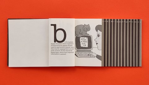
A page from The Abecedarian Office, illustrated by Chwast and published in 1985 by the Herman Miller Research Corporation.
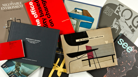
Similarly in “The Abecedarian Office: An Impudent Look at White Collar Work,” Chwast uses gesture, expression, and a loose but demonstrative line to achieve comic personae. This gem of a booklet published in 1985 and inserted into the pocket of a larger book, Everybody’s Business, was written by Herman Miller copywriter Clark Malcolm and designed by Sara Giovanitti, who then brought Chwast onto the project. A survey of traditional and nontraditional workspaces—from ideal to closet-size-cubicle—it showed how an office environment impacts a worker’s efficiency and attitude on the job. Chwast had a passion for both the alphabet and alphabet primers, and the resulting Abecedarian reveals his comfort with this conceit. The various office scenarios provided the opportunity to draw comic situations where he uses facial expression and body language to carry the emotional load. The words are integral, but the gestures get the laughs.
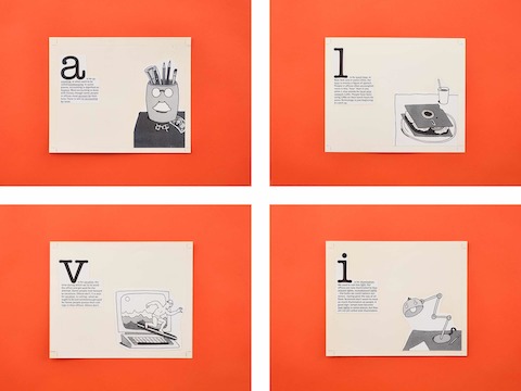
Mock-ups of pages from The Abecedarian Office, now housed in the Herman Miller Archives.
Chwast’s artwork for “I Was an 80-lb. Facilities Manager,” based on the famous Charles Atlas “I Was a 97-lb. Weakling” comic book advertisements, makes what could be a leaden theme into joyful visual slapstick. “That little booklet was so much fun. I especially like the cover,” Frykholm says about the promo done for a Herman Miller subsidiary Miller SQA (Simple Quick and Affordable) and on which he collaborated with Peter Bell, from Fairly Painless Advertising, a small agency in Holland, Michigan. Bell was the point person working with Chwast to devise a beleaguered facilities manager who acquires strength after calling his SQA salesman, who shows him the best way to solve all his furniture needs with a few keystrokes on a laptop. Chwast’s innocent drawing style not only fit the storyline but also injected a sense of optimism to the project.
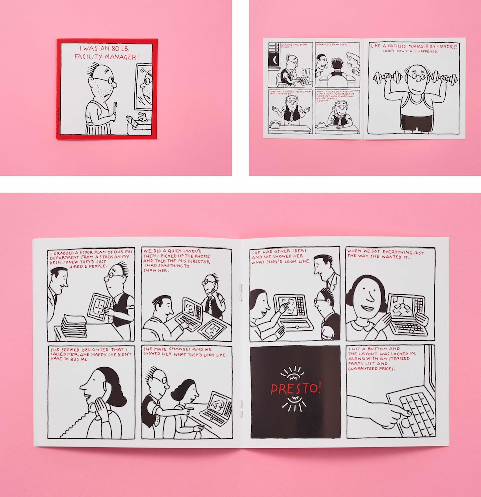
Spreads from I Was an 80lb Facilities Manager!, a brochure illustrated by Chwast for Herman Miller’s SQA division.
Chwast is now 84 years old, and his work is as playful as he is prolific.
For nearly seven decades, just as he pitch-perfectly illustrated the Herman Miller commissions, he has modestly contributed to the commercial art culture of his epoch. Okay, modest is a misnomer—his work is essential to the history of the form—but anyone who knows him will attest that he dutifully, albeit enthusiastically, does his “jobs” with no great agenda for fame and fortune, or ambition, other than to do his best (and enjoy himself in the process). Like a great chef at a restaurant where it is impossible to get a bad meal, Chwast never lets quality dip below his imposed standard. Of course, sometimes he produces those rare masterpieces of visual erudition too.
In 1986 (exactly thirty years ago), in my book Innovators of American Illustration, I asked Chwast if he was insecure about losing “the gift.” He responded immediately: “With the last drawing, I’ve done my last good idea. It’s a struggle since everything’s been done.” Then he paused, reflected a moment and said: “I imagine for younger artists it’s going to be a lot harder. They have to invent something completely different.” That’s never been his problem though. For all these years his work has created a bond with his audience. But he does have one regret: “I’ve exchanged innocence for professionalism. I would like to have both.”
