The Olympic games are not just a challenge for athletes, but for their designers. The world’s preeminent international sports competition has to level the playing field for communication too. Each sports event, each amenity needs clear wayfinding, and in a minimum of three languages. Those graphics need to stand above the crowd and out in the arena. Given that challenge, what would you do?
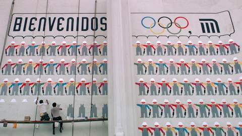
If you are Lance Wyman, you opt instead to make a picture. And this is exactly what he did, when he was 29 and won the competition to design the graphics for the Mexico ’68 Olympics. Nineteen pictures, one for each sport; 19 more for the cultural events; more still for restrooms, concessions, transportation. Rather than a sea of words, you create a hierarchy of icons anyone can understand. You put your graphics on free-standing signs, on pavements, on walls, so that they become a pattern in the city.
If you are Lance Wyman, you take that system of visual icons and you keep making it new. For metros in Mexico City and Washington, DC. For zoos in DC and Minnesota. Music, Mayan architecture or moose, when you go back to those cities 20, 30, 40 years later, you find they are still using your system. In Mexico City, they have extended your subway graphics, introduced in 1969, from three lines to 12, and from the underground to the BRT. When you look on an iPhone, 40 years later, you find icons made of the same simple shapes, the same rounded corners. Why? “They take up less space than words and they can be a common language, no translations needed.”
Lance Wyman began his career working for George Nelson, soon after graduating from Pratt in 1960. He created his first visual icons while working on the Chrysler Pavilion for the 1964-65 World’s Fair, now celebrating its 50th anniversary. While at the Nelson Office, he got the opportunity of a lifetime, an audition to design the identity for the Mexico ’68 Olympic Committee. He, his new wife Neila, and partner Peter Murdoch bought one-way tickets to Mexico for a two-week trial, at the end of which they produced what many still consider to be the best Olympic logo ever. But he also created his second set of visual icons, which have proved to be a sustaining element in his ongoing design practice, working as well for Mexico City today as they did in the 1960s. Today, Wyman lives and practices in New York City, continuing to design identity and wayfinding systems for transportation and cultural projects. He is currently working on a new visitors map for the National Gallery of Art in Washington. A retrospective of his work is scheduled for October 2014 at MUAC, the University Museum of Contemporary of Art in Mexico City.
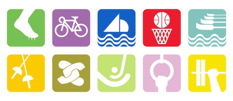
1968 - Olympic Sports (10 of 19 sports icons shown)
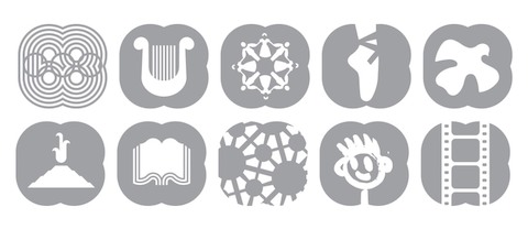
1968 - Olympic Cultural Program (10 of 19 cultural icons shown)
When did you begin working for the Nelson Office?
Irving Harper hired me in April 1963 to design graphics and signage for the Chrysler Pavilion at the 1964-65 New York World’s Fair. That was my first major project at the Nelson office. I do remember also making studies for a Department of Commerce logo and designing the graphics for a USIA exhibit on Industrial Design during that early period.
What important lessons for later work did you learn from Irving Harper? From George Nelson?
The Nelson office exposed me to an atmosphere where striving for great design was a given for everyone who worked there. I think Irving taught me it was possible to create serious design that included whimsy. George taught me that a designer can contribute in the grand context of everyday life.
Do you have a favorite anecdote about the way George worked?
I remember working late one evening preparing a tray of George’s slides for a presentation on design he was to make the following day in Chicago. As instructed, we left the tray on his secretary’s desk. His secretary kept her paperclips and rubber bands in a slide tray box and George picked up that box on his way out of the office the next morning. He returned from Chicago a bit upset, but also a bit satisfied. He used the paperclips and rubber bands as the props for his talk and he got an ovation at the end. It was a lesson in being flexible if you know your subject.
“Irving taught me it was possible to create serious design that included whimsy. George taught me that a designer can contribute in the grand context of everyday life.”
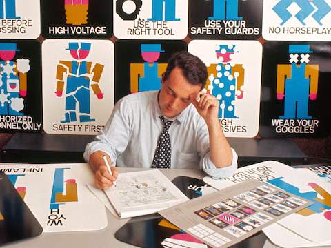
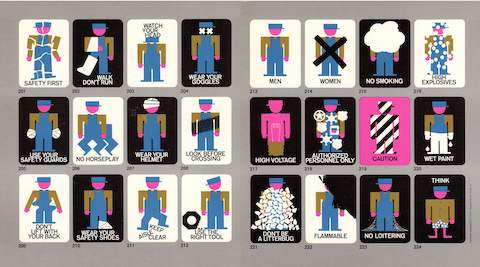
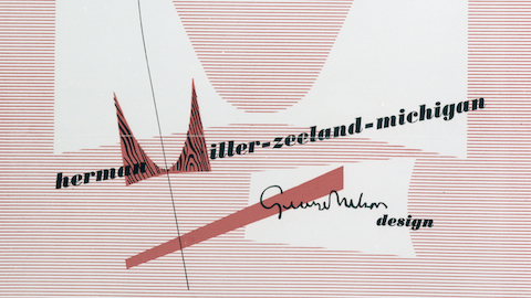
The Pronto Posters originated as safety posters for the Production Line Ride at the Chrysler Pavilion at the 1964-5 World's Fair in New York (Lance Wyman pictured above, 1965). The posters were eventually produced by Howard Miller and marketed as safety signage for factories.
Pronto Posters were the first time you created a purely visual system of icons. Why did you decide to just use pictures?
The Pronto Posters originated as safety posters for the Production Line Ride at the Chrysler Pavilion, which appeared on the front page of the New York Times Automobiles section on April 13, 2014. All of the Chrysler attractions were designed for children, so I kept the safety posters simple and to the point by designing a graphic factory worker to demonstrate the consequences of factory accidents. Safety hazards were familiar after working three summers in factories during my college years. It was George’s partner, Gordon Chadwick, who suggested the posters be made as real posters for factories. Howard Miller produced and marketed them as the Pronto Posters.
How did the Pronto Posters lead to the work you did for the Mexico City Metro?
The Metro was under construction during the Olympics, and I had an idea for the logo. I presented the logo idea to the organization that was designing and building the Metro and got the job. I first used the logo on a large painted wall of Metro workers welcoming the Olympics. My factory worker became a Metro builder.
What was the idea for the Metro logo?
The Metro logo is a suggestion of three train lines passing through a square (the center of the city has historically been a square called the Zocalo). The lines are filled with orange, the color of the trains. The upper right rounded corner transforms the square into a background shape for the station icons.
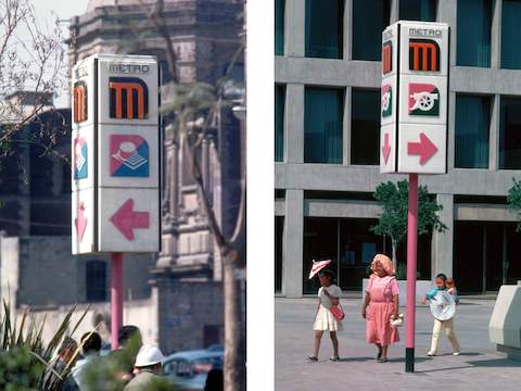
Mexico DF Metro signage.
At what point did you decide to make it a visual system?
The idea of making the Metro a visual system came directly from my experience designing the Mexico Olympic graphics. Olympic spectators and participants are global so it was a good idea to avoid verbal languages where possible by using icons as public communication.
When Tokyo hosted the games in 1964, they identified the sports events with stick figure icons. In Mexico, we identified the sports events with icons that focused on a detail of the athlete, the equipment, or a combination of the two. Tokyo developed icons for the Olympic public services, we did as well. Mexico also hosted a cultural program, 19 cultural events held simultaneously with the 19 sports events.
The Mexico Cultural Program was diverse (dance, stamp collecting, space research) and developing a unified system of icons that visually looked like a “Cultural Program” as strong as the sports icons was a challenge. It was that experience that gave me the insight to suggest the Metro stations be identified with icons as well as names.
How did you go about determining the look and feel of these icons?
To design each icon we focused on an image from history, an image of an existing structure, an image dictated by the station name, or an image dictated by an important function in the area in which the station is located.
The Pino Suarez Station is based on the image depicting the Aztec pyramid to the Wind. The station is named after a former Vice President of Mexico who was assassinated in office and there wasn’t much else associated to the station. I remembering struggling to find an appropriate image and then, an Aztec pyramid was discovered at the site. I remember feeling we were being helped by the Aztecs. The pyramid is integrated as a permanent part of the station architecture and is the station icon.
The Tlatelolco and Bellas Artes station icons are two other examples based on existing structures. The Tlateloco Station symbol is based on the image of the nearby triangular prism-shaped tower. The Bellas Artes Station symbol is based on the image of the Neoclassical/Art Nouveau Palace of Fine Arts .
“The idea of making the Metro a visual system came directly from my experience designing the Mexico Olympic graphics. Olympic spectators and participants are global so it was a good idea to avoid verbal languages where possible by using icons as public communication.”
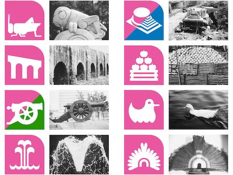
To design each station icon, Wyman and the internal Metro planning team, chose an image from history, an image of an existing structure, an image dictated by the station name, or an image dictated by an important function in the area in which the station is located.
Did your outsider status in Mexico City made it easier or harder to select icons for the Metro?
I find it is easier to objectively look at complicated data that I’m not familiar with when attempting to create a unified plan or system. I guess familiarity breeds habit and attitude—not necessarily bad, but difficult to get over to be able to create a more unified overview.
I was curious about two other design decisions you made: the custom typeface and the magenta line. What North American subway has a pink line?
I initially developed the typeface by experimenting with the forms suggested by the geometry of the Metro “M” logo. The resulting typeface was architectural, it looked good in the stations and was surprisingly legible.
At first the architects and engineers didn’t like the idea of having magenta as the color of the first line. I reminded them that Mexico owned the color and should use it. I was half kidding but the other half was based on how important magenta was in developing the Olympic graphics. It always made the Olympics feel more Mexican.
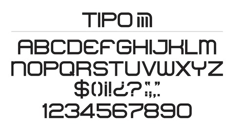
Mexico DF Metro typeface.
What kind of design guidelines did you leave behind for the Metro?
We didn’t develop formal guidelines after completing the initial three lines. Now there are twelve lines and the station icon strategy has been maintained. Icons are on exterior signs, on station platform walls, and on line maps in the cars. The one thing from the original intent that hasn’t been kept up is an all-icon Metro lines diagram map. I would like to have a chance to do that. Having recently updated the Washington, DC Metro map after designing the original 40 years ago, I’d like to update the map in Mexico City.
The National Zoo design program has a lot in common with the Metro. What did you do the same and what did you do differently?
On the Metro signs we used bold icons to identify the stations, on the zoo signs we used bold animal icons to identify the exhibit trails and areas. In both programs, we organized the icons in a vertical stack. The Metro signs had three icons, the Metro “M”, the station icon, and a directional arrow. The zoo totems were sometimes 16 feet tall and had as many as eleven icons, which helped make them visible in the hilly zoo terrain.
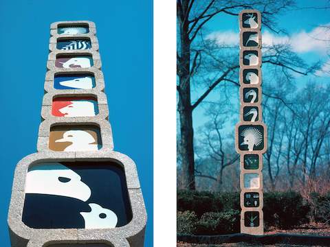
Wayfinding totems from the National Zoo in Washington DC.
The totems are very architectural. Did you ever consider doing buildings?
I love the challenge of communicating in the third dimension and the scale has sometimes been architectural, but the closest I came to doing functional architecture was in 1960, during my senior year studying industrial design at Pratt. I designed an expandable mobile home that won an honorable mention in a nationwide competition.
In your recent Walker lecture, you included an image of your Olympic sports symbols next to an iPhone with all of its little visual icons. Why?
Visual icons have always been with us. It wasn’t too far back that they were considered mostly as communicators for people who were illiterate. Now that they function so well indexing our digital devices they have proliferated and are accepted as communicators for all of us. I think they operate pretty much the same helping us navigate our virtual and real space. They take up less space than words and they can be a common language, no translations needed.
Alexandra Lange is an architecture and design critic based in Brooklyn. She is author of "Writing About Architecture: Mastering the Language of Buildings and Cities," and co-author of "Design Research: The Store That Brought Modern Living to American Homes."
