House rules
As part of the first in-house graphic design team at Herman Miller, Linda Powell and Barbara Loveland enjoyed creative freedom that led to some “hella good” design. Now they’re preserving it—and a whole lot more.
Written by: Christine MacLean
Photos by: Ross Mantle
Archival images: Courtesy of West Michigan Graphic Design Archives
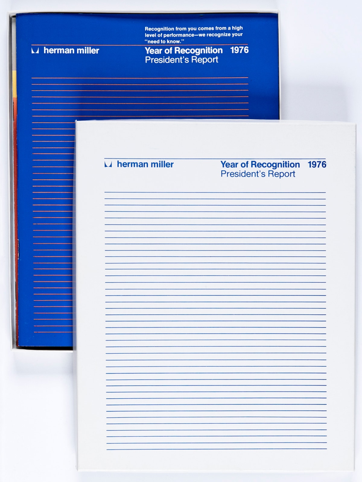
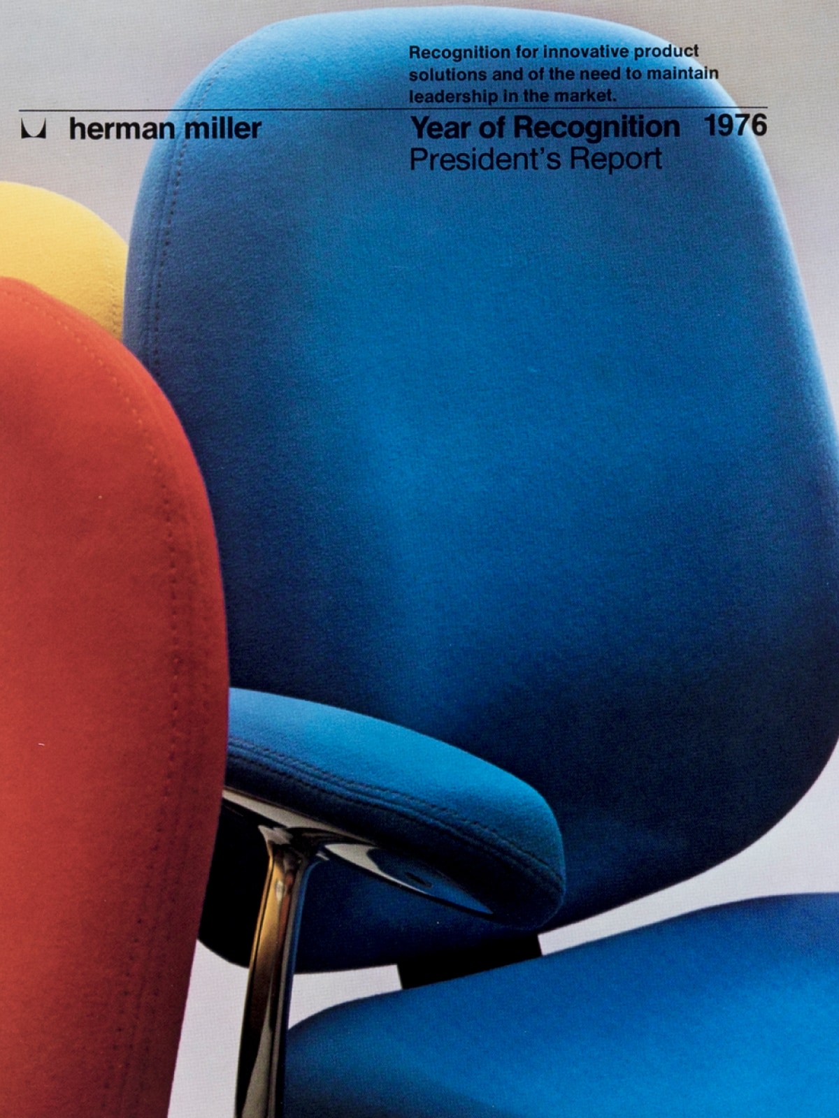
Barbara Loveland and Linda Powell both had inauspicious starts to their graphic design careers at Herman Miller. Powell had only been on the job a few weeks in 1976 when the packaging design she had proposed as a freelancer for the company’s 1976 President’s Report was failing in production. Steve Frykholm, then the head of graphic design at the company, had backed her idea for an injection-molded clear plastic box with a series of raised lines that echoed the design of the four-booklet set, but it wasn’t meeting quality standards. “I thought, ‘I’m going to get fired before I even get to do a project here,” she says.
And in 1977, Loveland almost didn’t get hired at all. Like Powell and Judith Ramquist, another member of the small graphic design team, Loveland had attended Western Michigan University’s design program, where all three had met. “Steve wanted more diversity [of educational background],” Loveland says, even though her work impressed him. After interviewing other candidates, he recognized Loveland as the strongest candidate, and if they had all graduated from Western, that was only a testament to the quality of its design program.
Powell didn’t get fired; Loveland did get hired. They both went on to have illustrious careers in graphic design by doing the work (collecting awards along the way), then teaching it, and now preserving it through the West Michigan Graphic Design Archives, which Powell and Loveland co-founded in 2013.
In celebration of Women’s History Month, we sat down with these highly accomplished designers, both of whom helped solidify and further Herman Miller’s rich legacy of graphic design.
The company was growing rapidly during the 1970s, and Hugh and Max De Pree, the sons of founder D.J. De Pree, each led the company while you were there. What was the culture like at Herman Miller?
Loveland: The De Prees still ran the business, and I think that made everyone feel like part of the family. As a matter of fact, when I left to go teach [at Ferris State University] in 1989, Max came over, sat in my office, and talked to me about what an admirable thing it was for me to be going into education. I'll never forget that. What CEO comes to an employee’s office and wishes them well when they're leaving the company?
Powell: I just ran across a letter from Max, a three-liner that said, “I was traveling in Hawaii, and somebody gave me this magazine article. I thought you might want it.” The article was about me. What CEO does that?
Loveland: Plus, people trusted us as designers. They didn't meddle. We would present usually at least two if not three proposals on projects, any of which we could live with, and [product marketing] would select one and then we’d go with it. There was no committee. There wasn’t any “I don’t like that color.”
Powell: And if they did say anything like that, Steve would back us up.
Loveland: And there was no competition among us designers. We didn't work for Steve, we worked with him. He was very generous in sharing meaty projects with us.
Powell: We were three independent designers all supporting each other and if Barbara did something that Steve really liked, he'd say, “Gee, I wish I'd done that.” And people we worked with made our jobs easier. You give those people in the in-house print shop a challenge, and you know, they complained. They might say, “There those designers go again.” But they were proud when a project turned out. I mean, you would just do stuff and somebody would figure out how to make it work. It had to be good; it had to be right. Second, it had to be on time. And then it was nice if it was within the budget.
Loveland: I think it was because the company was so design conscious.
Powell: And not afraid to try different or new things. We were very independent.
Loveland: They allowed us to try some things we might not have had the guts to do. The people who worked there were our friends and that was just how it worked.
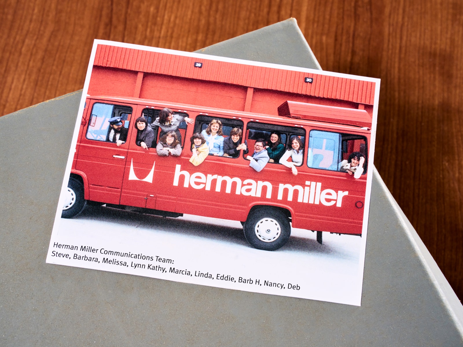
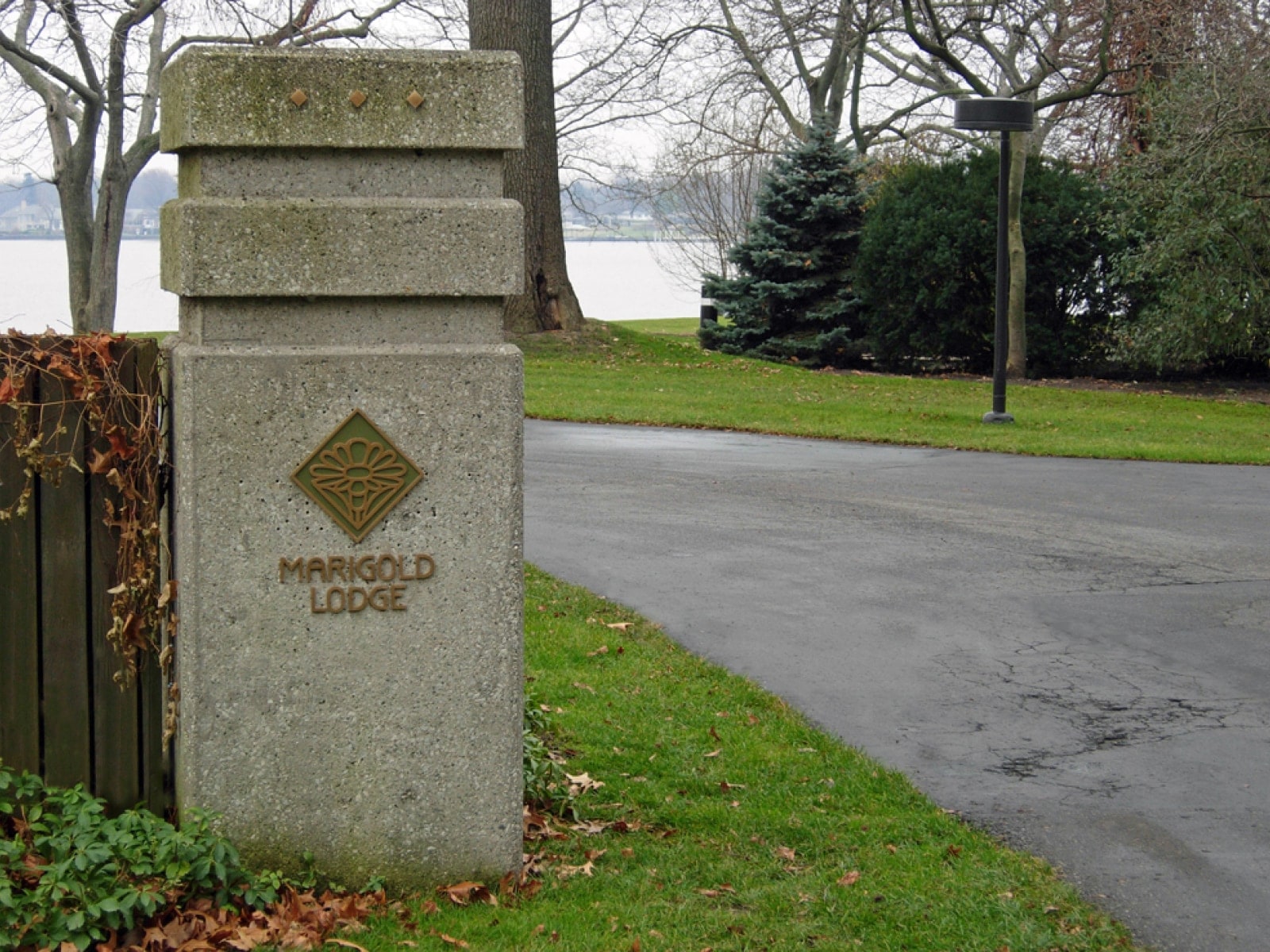
Powell: And we’d celebrate. If we got done with some big project, then we’d all go out to lunch. Or we’d go out to Marigold Lodge, and Steve would get on the tractor and pull us around in a garden cart. Steve was very good at that part. And he would bring people in. Anytime Steve had somebody coming in to work on a project, he would share that person with the rest of us, get that person to talk to us. People like George Nelson and Wolfgang Weingart.
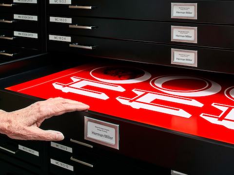
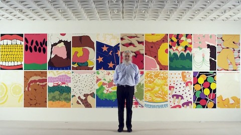
Above: Powell designed a "Ho Ho Ho" poster for the Herman Miller Christmas party in 1978. The theme was "the sounds of Christmas," and she designed four posters, each one featuring a sound.
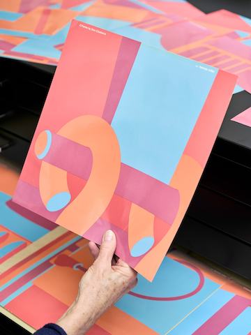
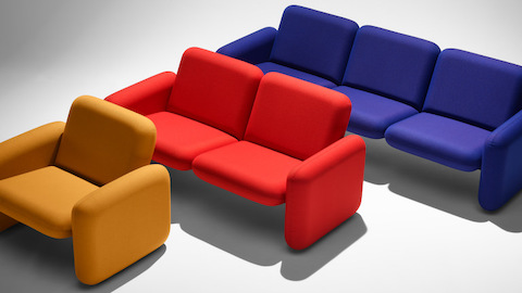
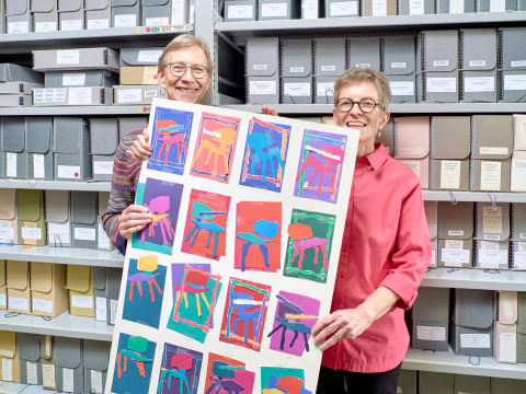
Right: In support of the 1979 launch of C-Forms modular furniture, Loveland designed 12 small posters that could be arranged in endless variations—just like the modular furniture. She said she chose "California colors" in honor of C-Forms designer Don Chadwick, who lived there.
You have such large bodies of work that include gems like Linda’s Christmas party posters and Barbara’s C-Forms posters. What was your favorite Herman Miller project?
Loveland: The Reference Points brochure [a printed piece that introduced the Eames Sofa, the last design Charles and Ray Eames did for Herman Miller, alongside other classics] because I could do whatever I wanted.
I had seen photographs of every angle of those products, and so I decided that it might be more interesting to illustrate them. I had some favorite illustrators in mind and I asked them if they’d be interested in creating an illustration of one of our products. Then we shipped them each a product. We didn’t give them any criteria. With Dagmar Frinta’s, you barely know it’s the Nelson Table. They had full rein. They would send sketches, and we’d say, “It’s looking good, keep going.” When those babies came in from UPS, we’d gather around and open the box and it was pretty exciting. Some of them were huge, and the one Alan Cober did of the Eames stool was only 12 x 12.
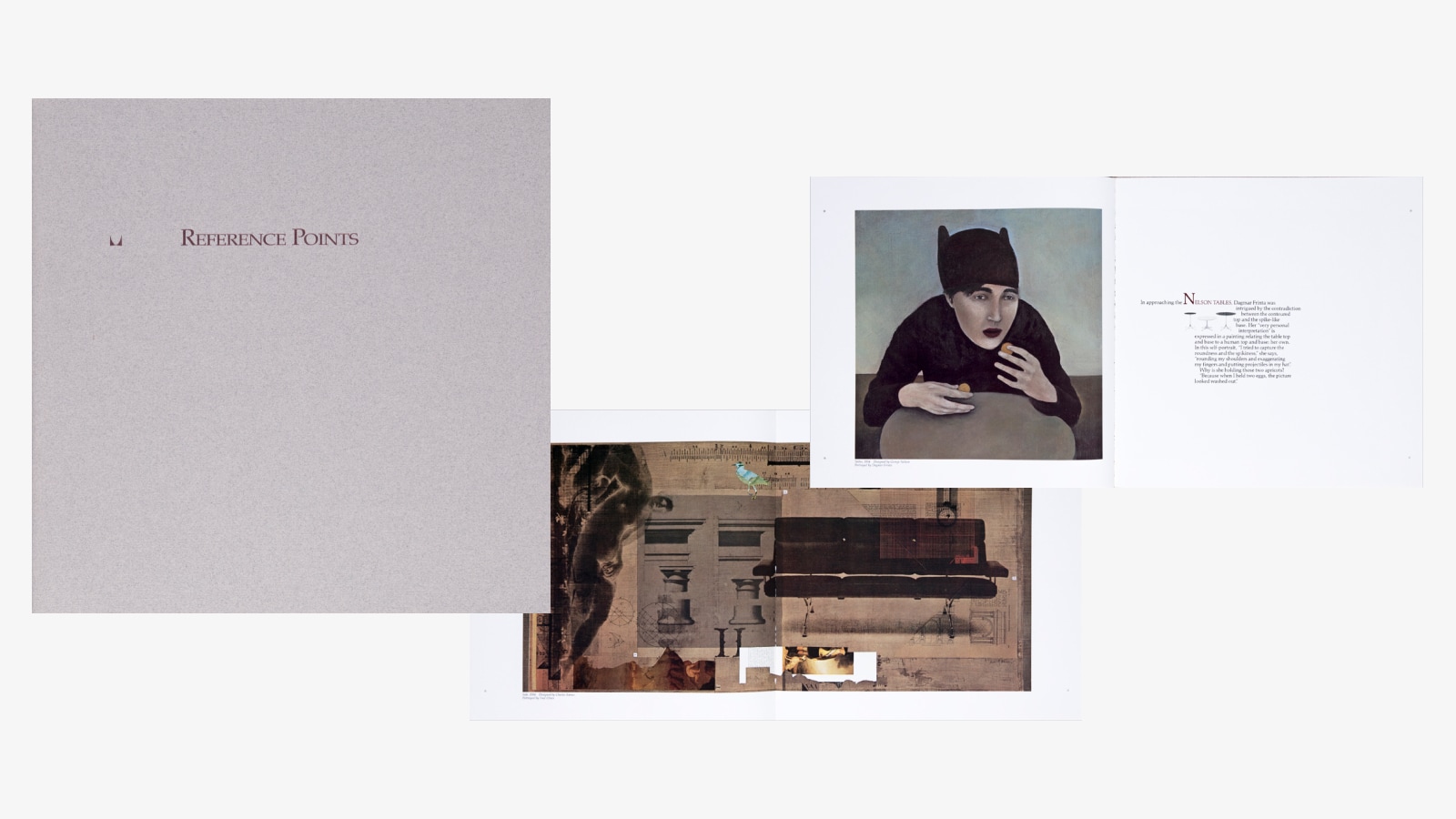
Reference Points brochure, Barbara Loveland, 1991
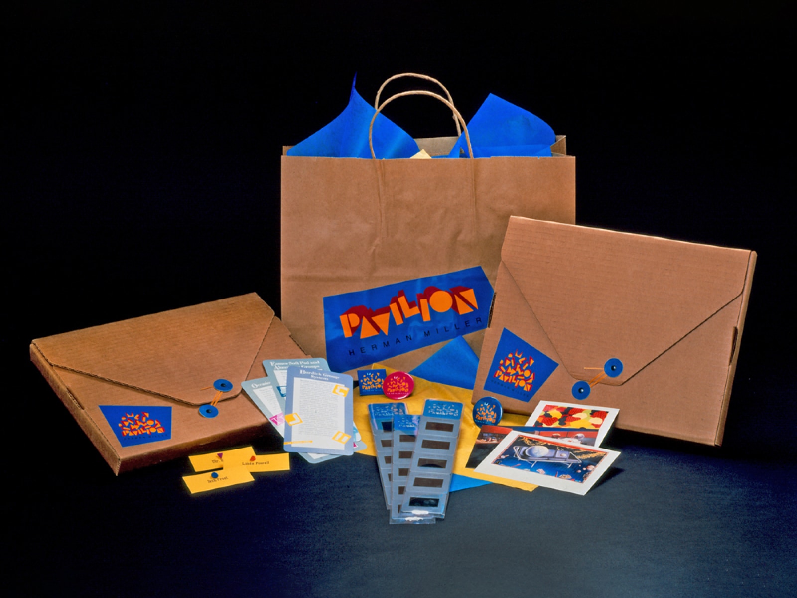
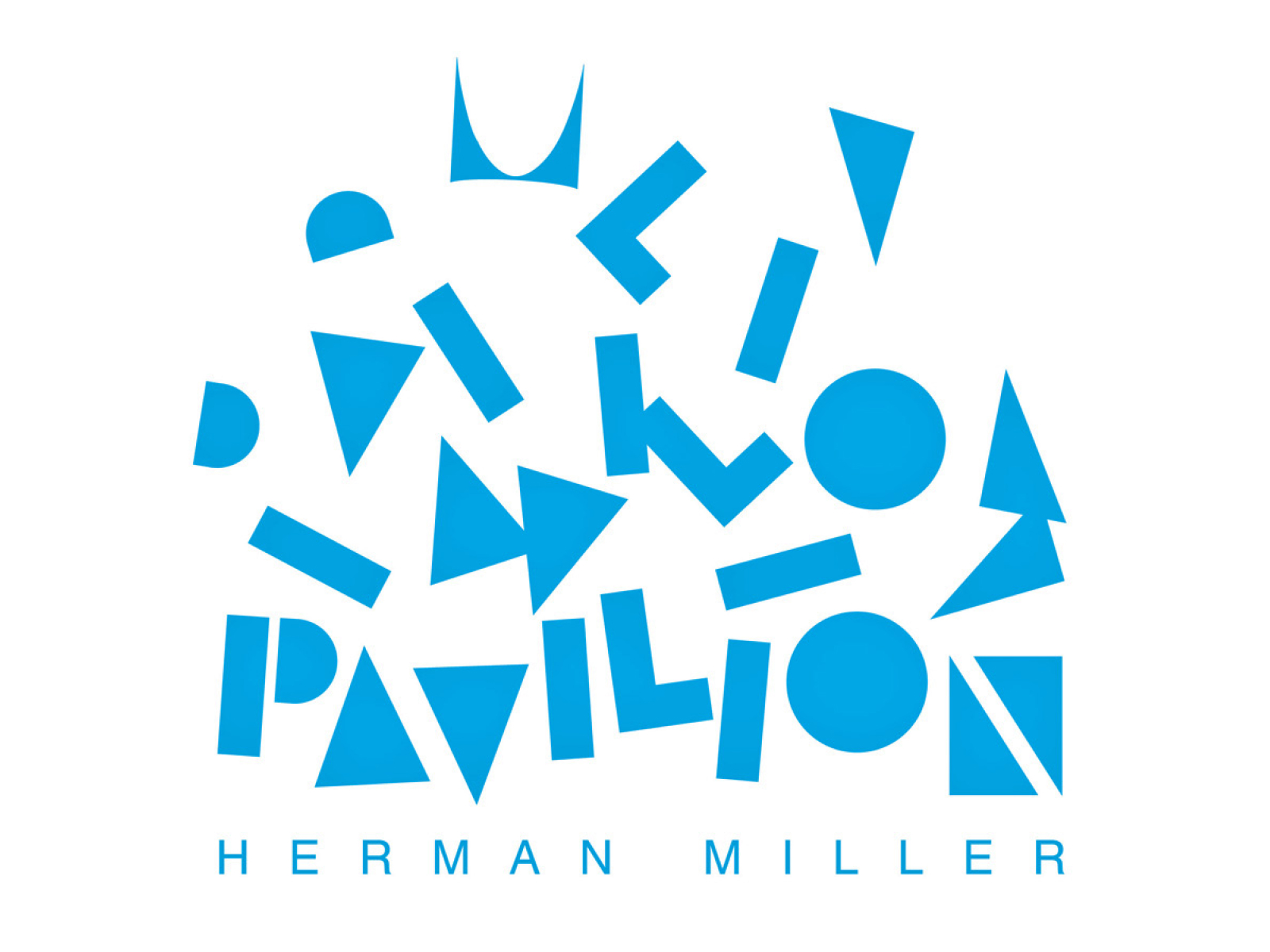
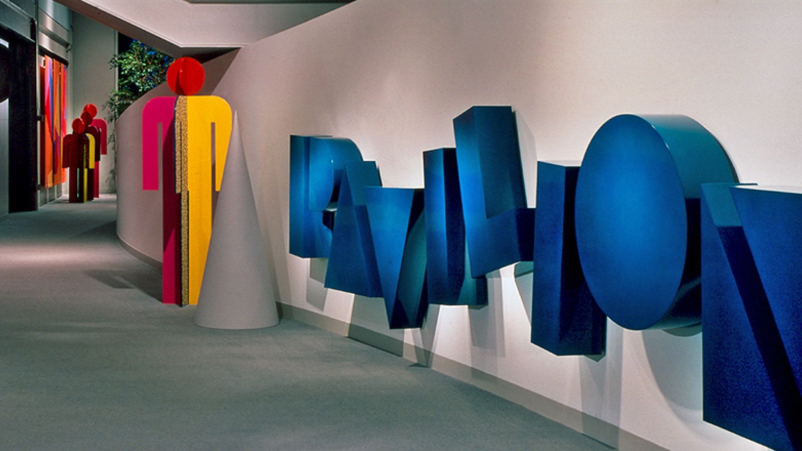
Powell: My favorite was the Pavilion identity program. The person leading the project wanted it to be like a playground—an active space, always changing. That's how the two marks just took the shape of these letters, in these simple, block forms that fall and make the word.
The other wordmark was made into a sign to enter down the esplanade. The letters were metal, three feet tall and a foot thick and stood away from, floated away from the wall. Then there were 12 banners in sets of four, and the colors kept getting brighter as you went down the hallway toward the entrance of the Pavilion.
Donovan and Green in New York had done the interior architecture, and they were going to do all the graphics, and I went to Steve and said, “You know, I think we can do as well as they can.” He agreed. That time we had a little group, and we did work together. Everybody came up with ideas. I managed the whole thing. That’s got to be my favorite just because it was huge, so long, and involved so much collaboration with good people.
Is that the project you’re most proud of?
Powell: No, that’s the Marigold Lodge identity program. This project was in 2004 when both Barbara and I were teaching at Ferris State University and Prescott Slee [Marigold’s hospitality manager at the time] called us and asked us to do it, and we said we would like to have our students work on it, and we would art direct.
So, over a three-year period, three sets of students redesigned the typeface based on an existing one and created a font. They designed a logo, folder, standards manual, stationery, a brass plaque, amenities, and menus.
I’m proud of it because we took what we learned at Herman Miller and how we had grown, going in there as novices, and we transferred it onto the students, helping them grow. We directed the work and they learned all the phases of design and production. The biggest thing was the learning.
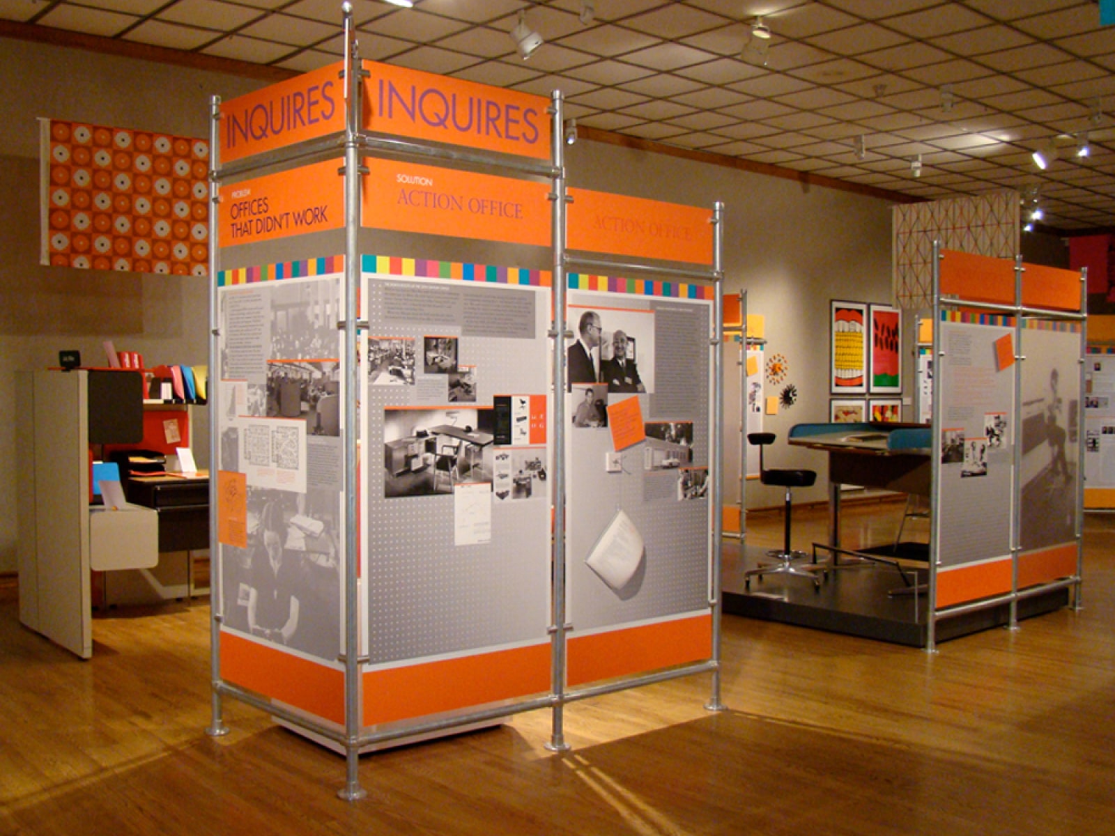
Loveland: And the experience the students had of going there and meeting with Prescott, who was so great with them. I’m proud of that project, too, but I think the one I’m most proud of is an exhibit about Herman Miller called “Good Design” at Muskegon Art Museum that I worked on with Judy Hillman, the creative director on the project. I had just left Herman Miller the second time. [Loveland had worked at the company a second time, 2005 - 2007.] I worked on it over the summer when I was down at my cottage, where there was no internet at the time. I have a picture of me sitting on a log in the woods where I could get phone reception, with my computer on my lap, talking on my phone. I developed a color palette and laid out all the graphics for the panels. The project was fun. The director of the museum, her team, and the creatives—it was just a great group of people to work with.
The exhibit was historical and very informative, and it traveled to the Henry Ford Museum in Dearborn and all over the country. I was really proud to go to those openings. My mom was still alive then and saw it.
You’ve both done award-winning work that’s been included in the AIGA National Design Archives in Denver; Cooper Hewitt, Smithsonian Design Museum in New York; and the Henry Ford Museum of American Innovation in Dearborn, Michigan. You both won AIGA West Michigan Fellow Awards in 2017, as well as other awards. What did designing for Herman Miller mean to you?
Powell: It gave me exposure and so many opportunities. I was able to collaborate on projects with the best graphic designers, photographers, illustrators, and printers in the country and, on occasion, the world. We also had working relationships with those in related fields—architecture, video, product design, interior design, exhibit design. I felt like I could experiment, stretch, and try new techniques and formats. I had the opportunity for personal and professional growth by attending national and international design conferences and leadership development conferences.
Loveland: The variety of projects was quite amazing, which gave me experience in all those different areas. The notoriety worldwide that Herman Miller has had as a design-focused company was certainly an advantage, as well as a challenge. Every project had to meet an expected quality level.
The successes I experienced were a result of opportunities presented to me, great people with whom I worked and the truly wonderful production managers at Herman Miller—not only did the design have to be extraordinary but the creation (printed or produced) had to meet those same requirements. Hard work and long hours on everyone’s part contributed to the results that were at times remarkable.
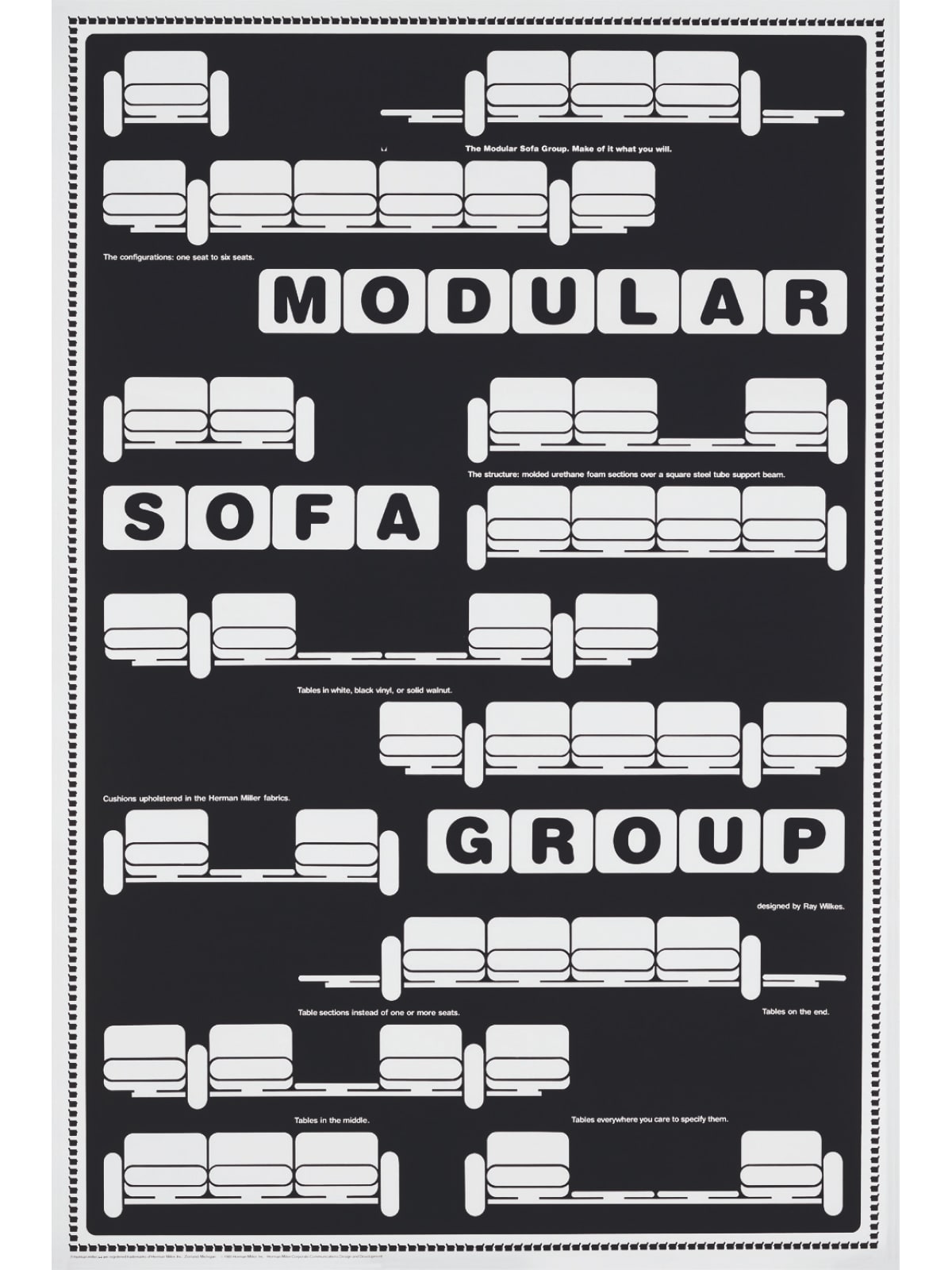
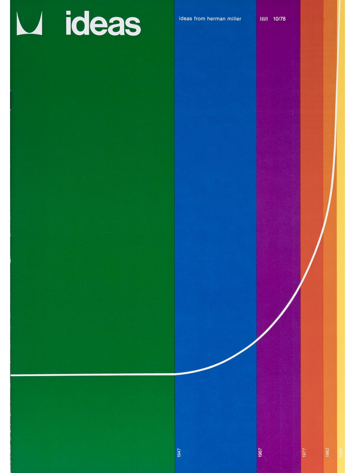
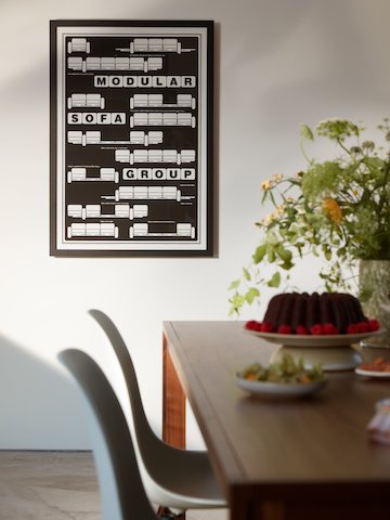
Barbara Loveland’s 1981 Wilkes Modular Sofa Group poster and the poster made from the front cover of the 1978 Ideas magazine designed by Linda Powell.
This spring, we are bringing back your work through the Herman Miller retail store—the Wilkes Modular Sofa Group poster that Barbara designed and a poster of an Ideas magazine cover that Linda designed. Can you tell us a little about those designs?
Loveland: The modular sofa poster was part of The Big Book [posters of 44 products intended to be hung as a "book” in showrooms]. What I wanted to do was show all the different configurations that it could be, and I was intrigued with the shapes because they were like Chiclets. Remember Chiclets gum? So, it was fun just to see how I could show variety with the sameness. And the typography was Helvetica Rounded because that certainly went with Rounded forms of that sofa, so it was again, a marriage of the typography with the imagery, which is what I like to do—make a connection.
Powell: For my poster, that issue of Ideas magazine was about organizations changing and things were changing exponentially, so the colors represent time and the line represents the rate of change. I wanted the colors to be intense, and I chose primary and secondary ones from the color wheel and put them in the same order, figuring you can’t improve on the color wheel. We carried that graphic through the entire magazine.
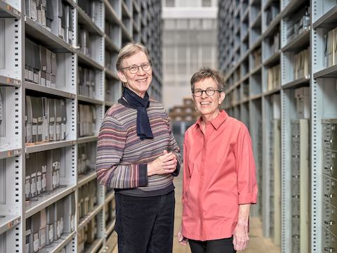
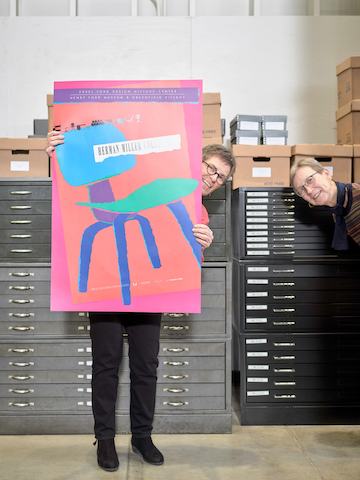
In 2013, Barbara Loveland and Linda Powell co-founded the West Michigan Graphic Design Archives, housed at the Zhang Legacy Collections Center at Western Michigan University in Kalamazoo.
People can see the Herman Miller work you did, as well as the work of many other West Michigan designers, at the West Michigan Graphic Design Archives in Kalamazoo. You co-founded that in 2013. How did it start?
Loveland: It all started when Jon Henderson, our professor at Western who became a friend, was downsizing and emptying his flat files in Kansas City. He had worked at Hallmark Cards. He said, “Take all this back to the archives at Western” . . . but then we thought let’s create a graphic design archives in West Michigan. The graphic design is so rich here, with French Paper, Herman Miller, Ferris, and Western.
Powell: It’s not just about design. It’s about printing, writing, typography. It’s free to visitors, and it’s in this beautiful facility that was built to be an archive. You can make an appointment on the website and tell them what you want to see. They also have an overview they give. I never thought when I retired this would happen. I thought my graphic design career was over. It’s not over.
Loveland: I think good design will always be near to our hearts, and anything we can do to help people understand the difference between good design and not-so-good design, I think that’s still important. Everything in the graphic design archives is curated.
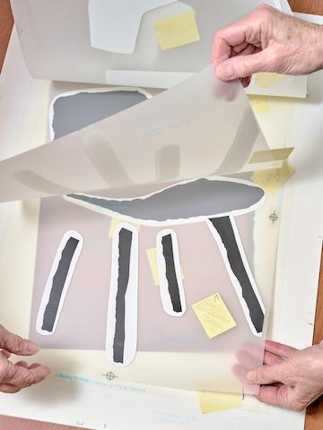
We were downsizing and cleaning out our stuff, too, and we wanted to preserve it. A lot of wanting to preserve it had to do with the computer. We wanted people to recognize how the work got done before the computer. We once explained to a student group the stages of the Henry Ford poster—the color sketches, the mechanical, the color proof, and then the final piece. One young woman raised her hand and asked, “So when did the computer come into the process?” And Linda said, “Never.” I think they need to understand the history [of printing] to understand how it’s done now.
“I get excited when I get to work on the archives project. That’s been a nice carrying on. I studied graphic design, I did it, I taught it, and now I’m preserving it.”
—Linda Powell
Where do you find inspiration now?
Loveland: I’m weaving and knitting so I’m inspired by combinations of colors I see in nature—or yarn stores.
Powell: I get excited when I get to work on the archives project. That’s been a nice carrying on. I studied graphic design, I did it, I taught it, and now I’m preserving it.
Browse archival posters
For a century, Herman Miller has produced graphic ephemera with the same exacting standard of our furniture. We’ve pulled some of our most iconic pieces from the Archives for your walls.
Shop now
