Products
Formwork: Stackable Desktop Storage
Designed by Sam Hecht and Kim Colin to help you bring order to papers, tools, and artifacts
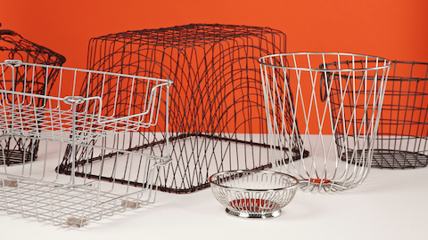
Bringing order to the chaos of the desktop was the baseline consideration of Formwork, Sam Hecht and Kim Colin’s new stackable desktop storage system. But the designers’ approach to achieving that larger goal was made up of many highly considered design decisions that manifest in the product’s range of size and shape, intuitive utility, and interchangeability. It is what makes the seemingly simple elements of a pencil cup, a large and small tray and box, a media stand, a paper tray, and a tissue box, work together to create a sophisticated, unified system.
WHY talked to UK-based Creative Directors and Principals, Huw Morgan and Paul Neale, and Senior Designer Mike Montgomery of Graphic Thought Facility, about creating the graphic language and packaging—as well as an animated short—for Formwork and how a similarity in their approach to design, makes their frequent collaborations with Hecht and Colin all the more fruitful.
How did you first start working with Sam and Kim?
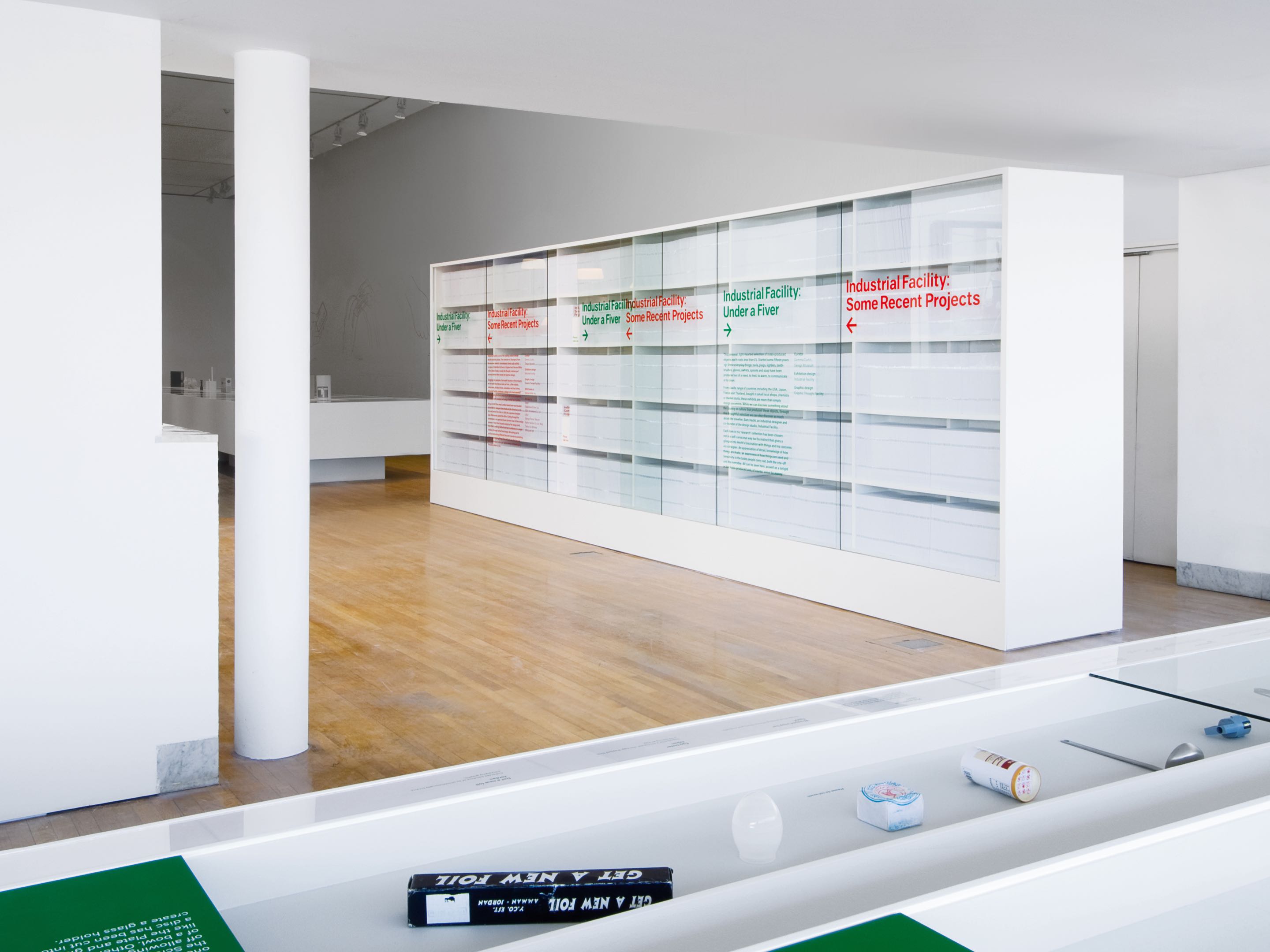
Paul: Since 1999, we have been doing various small projects on and off with Dunne & Raby, who are based in London and momentarily had a studio space very close to Sam and Kim. Both Dunne & Raby and Industrial Facility were invited to present an exhibition of their work at the National Museum in Jerusalem. Tony [Dunne] and Fiona [Raby] invited us to design a publication to accompany those two presentations, so we got to know Sam and Kim through that. Then Sam and Kim were invited to do a presentation at the Design Museum in London. They decided they were going to put on two shows simultaneously: one of Industrial Facility’s recent output, and the second show of Sam’s collection of found objects. They were aware that there was an opportunity for the graphics to unify the two [themes]. They asked us to design a catalog and graphics for the space. We proposed that the yet-to-be-built entrance wall be made as a bookcase to contain the free catalogs that would be given away at the show.
Mike: It was actually quite a difficult space to work with. To the left of the entrance, contained the set of Sam and Kim’s recent projects, and on the right contained his Under a Fiver collection. So the bookcase kind of unified the space. It was a way-finding device as well.
Could you talk about some of the design decisions you made with the packaging and presentation of Formwork?
Hew: Herman Miller requested that we not work in a specific way, but instead go back to the root of what’s really interesting about this project, which is a kind of quality and simplicity of materiality—and I guess the usefulness of quite small things. What was really interesting for us is that we had a nice point of contrast between these very simple forms, and the fact that the product comes to life when you started dropping things into it. Where we got to quite quickly was that we should treat the little objects that populate the product in the way that Sam had treated the product itself, which is in a very kind of reductive, simple way.
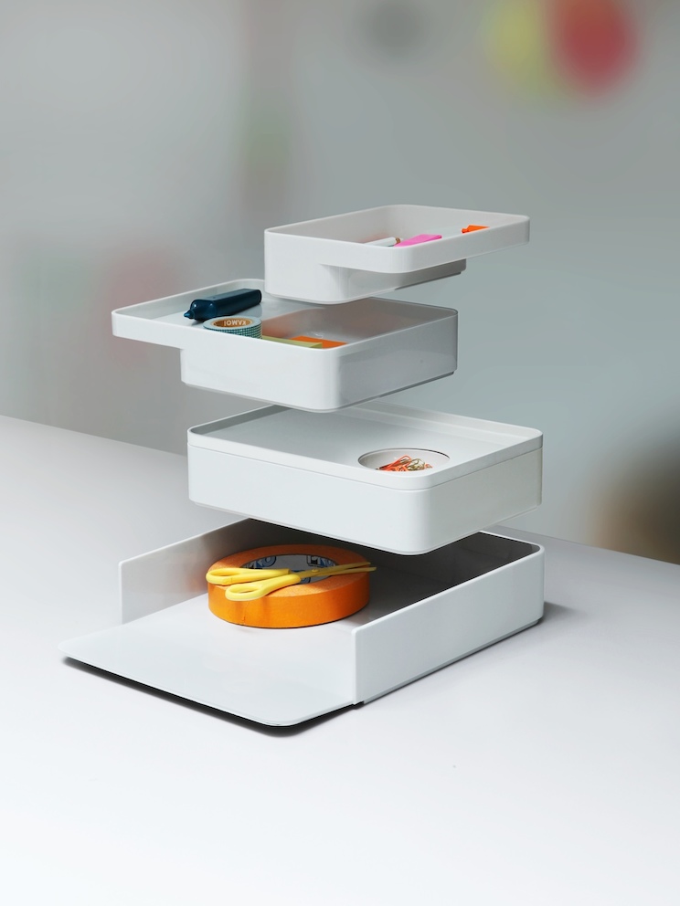
Paul: One of the big decisions in the design process was the photography. Do we photograph this in a studio, in a really clean way, or do we let it out into the real world with the randomness of other objects? Where we ended up was kind of straddling both camps. Despite being set in a studio, we certainly want to suggest usage. We felt it was important to bring life to the products. That’s why we used the edge of the table. That’s why we show an environment of other objects of furniture in the background to kind of get them away from packshot-ville, really.
Could you talk a bit more about the styling? It seems to highlight Formwork’s utility but in a very orchestrated and controlled manner.
Hew: We were trying to get to a point where it felt very stylized, almost like a painting—being self-conscious and not conscious at the same time. So the product in itself has got a real ease to it, but it’s incredibly, carefully thought out, planned, refined. We were trying to imbue [the design] with the kind of thought process that Sam and Kim go through [in their design work] and not separate it from the way the product is presented. Originally, we were looking at the objects being in real space—in very familiar, simple settings, but they’d be doing quite extraordinary things like floating and disappearing, and splitting themselves up. We moved away from that quite quickly and made a very considered thing that allows you to do those kinds of tricks without it seeming odd.
It’s nice that those decisions, like having the pieces of Formwork floating in space and splitting, are not just tricks, they also show the utility of the product.
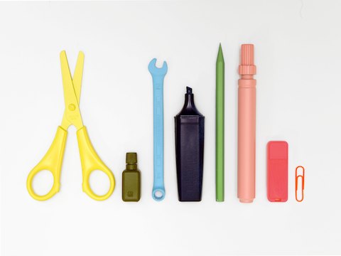
Mike: The thing that adds to that almost unreal sense of the images is the props themselves. Everything that you see, the images have been created by a model-maker that we work with regularly. We look at everyday objects that go into Formwork and we found the richest forms that they could possibly be. They were made by the model-maker and sprayed in specific colors to use as props for the images. So they aren’t things that you buy off the shelf.
“The product in itself has got a real ease to it, but it’s incredibly, carefully thought out, planned, refined. We were trying to imbue the design with the kind of thought process that Sam and Kim go through in their design work and not separate it from the way the product is presented.”
- Hew Morgan
So you fabricated real objects in an ideal form and palette?
Hew: Yeah. The palette and the objects were each determined by us, and most were made by our model-maker. They were all based on real things, but in some cases were not quite like real things because they were just as pared back as the Formwork vessel that was holding them.
What made you guys go that route as opposed to just collecting and styling found objects?
Paul: We were always mindful of the way Formwork is intended to tidy away, to clean, to take control of working spaces, and the idea of that being an amount of control put upon the creation of these objects in themselves, rather than be a chaos of found materials.
Mike: It’s amazing that when you put the product down in front of the camera and start using real world objects with it, the details that are contained in just a roll a tape become quite noisy quite quickly, so being able to create a roll of tape, which is a perfect version without too much detail, helps the whole image remain calm
“When you put the product down in front of the camera and start using real world objects with it, the details that are contained in just a roll a tape become quite noisy quite quickly, so being able to create a roll of tape, which is a perfect version without too much detail, helps the whole image remain calm”
- Mike Montgomery
You also worked with Industrial Facility on their book The Usefulness of Small Things. Not that the two projects necessarily inform each other, but Formwork certainly is a system with which you can contain and organize small and useful things.
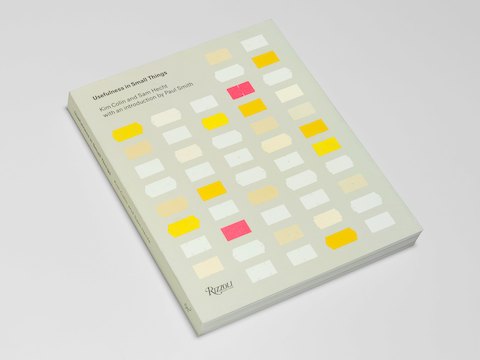
Paul: Usefulness in Small Things is a book of Sam’s collection. Each of the 88 products in the book has a huge variety of different materials and aesthetics. Some are quite complex, some are quite simple, some are beautifully made, some are actually quite trashy. The thing that holds them all together is Sam’s interest. He’s the common point. So the graphic thread we developed to hold them together—the decisions that we made in terms of how the objects are photographed, sequenced, how the typography is positioned—all are expressive of his aesthetic more than the aesthetic of the individual objects. But having said that, we did make the decision that every object in that catalog should be photographed on a different background—a background that is sympathetic and led by the object itself. Beyond that, the whole book, including the type on the cover and the credits at the end is all set in the same type. Not only in the same typeface, but in the same size—one size of font for the whole book. It has a rigor to it.
Could you talk a bit more about the photographic approach for Formwork?
Hew: We developed [the concept for Formwork] to a point where we knew almost exactly what we wanted it to be, and then the challenge was finding a photographer who would be willing to work with that amount of input from us. We went with a great, young photographer called Milo Reid. We knew we wanted to try and shoot this on a Bellow’s camera, so we had control of depth of field. He was great, actually, because we shot the product separately to the background, and the two images are then composed together. So we shot the product, and what that allowed us to do was really concentrate on getting the product looking as good as possible, and then we could do the backgrounds in a similar set-up.
Paul: Before the shoot happened with Milo, it had already kind of happened once in a rawer state. We worked through a version of it here ourselves, adding color and Photoshop tweaking the overall palette, making a lot of the final decisions on the props at that point.
Mike: We can work in 3D as well within the studio, which is kind of unusual for some graphic design studios, and we actually got the 3D renderings from Industrial Facility to help design all the boxes. We had a render that allowed us to figure out where each product set up needed to go and what props were going to go in it. So the final image doesn’t look too far off from our rendering.
Hew: We got really close to the final concept very early on, and then what you need from the photographer then is patience with us—a willingness to kind of just get it done. A project like this is incredibly time-consuming because each product has to be re-lit. It’s a long-winded process that you then have to compress into quite a short amount of time.
How long did the photo shoot take?
Hew: It really probably should have been a five-day shoot, which we did in three days.
Was that due to the technicality of it?
Mike: We did a lot of planning for each set-up, but we like to have a lot of choice. So for every product set-up, we did multiple prop variations, so we have a lot of outtakes that didn’t make it. I think we had sort of four or five images that we liked for each product, and it was quite difficult to choose the one we would go with.
All of these decisions played into the larger packaging concept I’m sure. Could you speak to that?
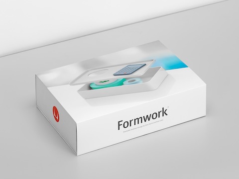
Paul: It was more a recollection of the Lego packaging from the 1970s, which was very clean, very stripped back. Partly because it had to be, because they had one style of packaging, which was sold all around the world, so there’s very little language on it. We saw some commonality with some of the issues we were going to have with Formwork in terms reducing the language that was on the packaging.
What prompted you to create the short motion piece with Studio AKA for Formwork?
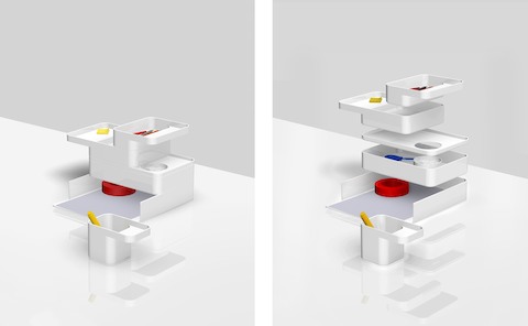
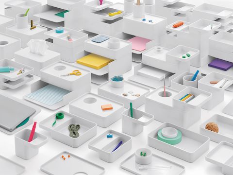
Hew: Formwork lends itself to an animation because it allows you to expose something that you can’t in a static image. We’d always proposed that we show the images in pairs—before and after, a kind of a single image in its unexploded state, and a single image in its exploded state. So there was already a kind of sense of animation in the stills. Herman Miller had always talked about animation because they started doing that for some of their products, which was great because what we had done was already the starting point for that medium. We went with an animation and production company Studio AKA [https://www.studioaka.co.uk/] that we’ve worked with before, who really took the visual language and kind of used that as a springboard for both the very first shot, and the resolution right to the end. So you start with the single item, and then you end with the cityscape.
Paul: The vast majority of the work AKA does is character based. We thought that would be interesting to get them involved because we wanted them to imbue these objects with character.
Mike: It’s the actual props that are bringing the character into what you’re seeing. The props have the freedom to move in an organic, natural kind of way, and the Formwork product comes in, in a reductive, simple way. Animators are used to bringing characters to life—they have the skills to be able to make a paintbrush feel interesting when it’s dropped into a cup.
“Formwork lends itself to an animation because it allows you to expose something that you can’t in a static image. We’d always proposed that we show the images in pairs—before and after, a kind of a single image in its unexploded state, and a single image in its exploded state.”
- Hew Morgan
Is every shot in the film all in line with your specifications?
Mike: They were; and we actually worked quite closely with Sam to agree on each set-up at the beginning, because it was important that we included all the combinations of Formwork that Sam felt that people should see.
Is there an interesting tension or interplay working with such a strong visual client like Industrial Facility?
Hew: All industrial designers—like graphic designers—have a very defined visual language, so usually it’s about finding a way of transposing that into graphic communication. In the case of this exhibition project, the thought process felt right because it was attempting to do something that Sam and Kim often attempt to do, which is to make more functionality out of a single thing—to get more out of doing less, so to speak.
Paul: It always helps if you like the product, of course. Sam certainly didn’t say to us, ‘I think it should be this typeface or that.’ With Sam and Kim we get the clearest explanation of the thinking behind their product. That’s what we need at the beginning, and then we kind of go away and try to make the clearest interpretation of that through the communication channels, whether it’s packaging, or if it’s point of sale, or if it’s film.
Mike: When it came time to begin Formwork, Sam suggested us for the job because he felt that we had learnt his visual language sufficiently enough that we could approach the project without him needing to interfere. So by that stage, we were trusted to produce the visual language for the packaging, and that it would relate closely to the design.
Paul: [Collaborating] with Industrial Facility probably works particularly well, because there’s something quite graphic in their approach. It often works on two different levels. One level is about detailing; it’s about lots of small, formal design decisions, reductions, quality of material, quality of production. But often there’s also a bigger idea present. In Formwork, it’s the notion of using vertical desk space. I suppose that’s the equivalent of what we would call in our world ‘a big graphic idea.’ It’s a very tangible, big concept to take and develop visually.
